


CAPSTONE COURSE FINAL REPORT
Enhanced Human Machine Interface for Building Automation System Dashboard
Our capstone project is an inter-disciplinary approach to enhance building energy information compilation and presentation techniques. In this paper, we will address human machine interface, user behavior and the importance of feedback for commercial building engineers. In addition, we will discuss different kinds of information and optimal ways to present them to users.
Before coming up with our recommendations and design, we tried to identify the basic questions such as who is our user, what do they want to accomplish, what do they need to know to accomplish it and what other relevant information is required to support their goals. Given that our user category consists of busy people who do not have time to play around with the dashboard tool and figure things out, the designer needs to feed the information they need to know at the right time so they can move on to the next task (Building IQ Hejmanowski, 2015)
[For details see section 7: Anticipated Audience].
Based on research including a literature review, building engineer interviews, and internship work with CUNY’s Building Performance Lab and Johnson Controls, we selected building engineers as our key user group. In addition, we identified a way of incorporating occupant comfort feedback in the building operations decision-making process. We added this feature on our dashboard as occupant comfort is typically the most important goal of any building engineer. The building occupants will not be involved in any kind of energy management process apart from providing their feedback on room, zone or floor comfort conditions such as too hot, too cold, odor, etc.
Using Stephen Few’s ideas as a foundation, we tried to keep our dashboard recommendations simple, efficient, straightforward, and focused. We aim to offer the information our users would like to see and use on a daily basis. Our dashboard is a visual display of the most important information needed to achieve the building engineer’s objectives – occupant comfort, equipment status, and energy savings. This information is arranged on a single screen for quick peek and offers a drill down for detail on demand (Building IQ Hejmanowski, 2015).
Day-to-day decisions of a building engineer are driven primarily by occupant comfort followed by energy efficiency. We realized the engineer would be able to make better and timely decisions if they were presented with real-time and actionable feedback. Based on the findings, we came up with a set of recommendations to enhance the data configuration and visualization practices and built a sample mock-up[1] to be tested with building engineers, our target user group.
The overarching goal of our capstone project is to propose optimal data visualization methods for presenting building performance information on building automation system human machine interface also known as energy dashboard for commercial buildings.
In thinking of where we can contribute towards energy savings, we decided to tackle the problem of inefficient building operations. Drawing on our engineering, architecture and visual arts backgrounds, we decided to conceptualize a building operations HMI to improve operator workflow and generate attention towards opportunities to save energy.
Ideally a BAS will monitor building operations and support the operator while the associated communication display (dashboard) will provide feedback, trending and calls to action that will ultimately result in improved energy efficiency, reduced operations cost and optimized occupant comfort. In order for this relay of information to occur, the BAS must provide meaningful information, the dashboard must display it in a clear, concise, and meaningful manner, and the building operator must gain meaningful, actionable data that allows him or her to direct building operations accordingly.
The Pacific Northwest National Laboratory and others, including the CUNY Building Performance Lab are investigating solutions to effect energy savings across building operations, from creating KPIs to training operators. Our goal is to contribute to this effort by building a dashboard prototype that compiles multiple systems into one HMI allowing building operators to see and capitalize on opportunities to save energy while also facilitating their day-to-day operational goals.
We aim to build out a set of minimum standards to ensure that BAS dashboards communicate effectively with building operators and allow them to maximize energy efficiency within the buildings under their care.
Our capstone project was carried out in two major phases, the survey phase and the design phase. The first phase involved researching existing building automation systems and existing energy dashboards, interviewing building engineers for their responsibilities and day-to-day tasks with the building automation system, discussing limitations within the existing tools and ways to enhance them. Our design phase involved bringing together all our findings to develop a working prototype of an energy dashboard that serves our selected category of users.
The objectives for the survey phase included: [For details see section 6, 7 & 15]
- Understanding the organizational context in which BAS[2] are used. Selecting and documenting our primary user category, their challenges and preference for presenting building energy information.
- Literature review and research to understand building automation systems and energy dashboards; to identify existing automation software and dashboard tools.
- Studying the building energy information available to users and the tools used to interpret it.
- Understanding user behavior and need for better visual communication methods.
The research involves identifying existing methods of the display by looking at various building automation and dashboard modules available in the market and surveying our primary user category – building engineer, who monitors and controls the performance of a building. We interviewed building engineers to understand their daily tasks with a building automation system and whether the enhanced user access would encourage energy efficient decisions. We made “contextual inquiries” to identify their current tools and modes of visualization. Our aim was to understand their user experience, usability, and the limitations of the existing tools (Lehrer et al., 2011).
The objectives for the design phase included: [For details see section 7 & 8]
- Compiling the findings from the survey phase for developing our design parameters.
- Brainstorming types of key performance indicator metrics that will display only the most important and relevant building energy information.
- Designing list-based and summary-based reporting.
- Developing a mock-up of an energy dashboard based on our findings, user preference and the information we believe users will find helpful.
Our research revealed that energy performance and building data varies for every building, and that existing tools used to diagnose the data have numerous limitations. For many building engineers, visualizing, benchmarking, and analyzing their data is a tedious, time-consuming do-it-yourself responsibility. Most engineers do not have access to data visualization tools and have to rely on data exported from their building automation system into spreadsheet for data visualization purposes. Based on the research and user survey, we saw a need for better compilation and visual communication of energy data. Our goal is to provide an overview of the energy data provided by the systems and include a drill down for further investigation. (Lehrer et al., 2011)
According to the United Nations Environmental Program literature, buildings use roughly “40% of global energy” and are responsible for of 1/3 of global carbon dioxide emissions (UNEP, 2015). The Pacific Northwest National Laboratory’s Building Retuning literature asserts that “commercial buildings are responsible for nearly 20% of the United States’ energy consumption and that up to 20% of this is wasted due to improper operations” (PNNL, 2015).
As noted by the Pacific Northwest National Laboratory, large commercial buildings are key examples of buildings that, when operated optimally, can contribute to significant energy use savings. Unfortunately, many buildings either do not achieve the projected energy efficiencies stated by their designs or experience decays in efficiency over time (PNNL, 2015). In order to manage their operations, including energy expenditures, many large commercial buildings are fitted with either full functionality Building Automation Systems (BAS) or lighter versions with more basic functionalities. These systems can be custom designed for the building itself or purchased by industry providers. As a whole, the commercial building management industry is faced with a number of commercial options to manage building operations and does not have a standard with which to evaluate the effectiveness of a given BAS (Samouhos et al., 2012) (Bobker and Paaswell, 2014). This results in a market for BAS options that lacks key performance indicator (KPI)[3] standards, performance standards, and an overall lack of awareness on anticipated results beyond day-to-day functioning of a building (Bobker and Paaswell, 2014).
Many building engineers look at their automation screens in the morning not because of priority but out of habit, and so it is important we show them what they would like to see. It is essential to strike a balance and optimize the data displayed. Our goal is to offer ideal dashboard practices for commercial building engineers (Patil and Mason, 2015).
Beyond the lack of minimum performance standards for the functional activities controlled by a BAS, there is even less in regard to how BAS operational factors should be communicated to users, who can be building engineers, building operators, tenants, building managers, owners, or other stakeholders. The communication portion of the BAS is often a screen with a snapshot of the building system components and is woefully lacking in the design principles that support clear, concise, and easy communications that support building operator activities. In the few examples where BAS HMIs include key performance indicators (KPIs) that support building operator activities, they lack integration with other data streams (Johnson Controls, 2015) such as occupant comfort complaints, weather, equipment maintenance, etc., driving operators to inefficiently switch between different systems.
The BAS screens we have encountered in our research have largely had process-instrumentation design (PID) screens featuring “point in time” data. The PID screens are built out of equipment schematics and, while we encountered operators who swear by them, are not ideal in recognizing trends that support operational efficiency. For example, the TRANE interface used by the Bronx Criminal Court features a PID screen that provides various measures on equipment indicators but scant context on what the right measures should be. It is not clear what optimal measures are and even whether a particular piece of equipment should be on.
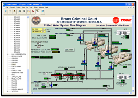
Figure 1: Example of BAS screen
Source: Bronx Criminal Court BAS, 2015
Additionally, we have encountered instances where different systems that tie into building operations are segregated and not included in one screen. For example, the Empire State Building operations staff uses a separate system to receive occupant comfort complaints that drives alerts to operators’ cell phones. This practice decentralizes the building operator’s workflow and makes it difficult to have centralized, “trendable” data. We envisioned a dashboard module that allows the operator to see current comfort complaints alongside temperature readings right on the primary BAS HMI screen.
Our vision of an improved HMI includes data streams from multiple systems centralized within one concise screen, along with the drilldown ability to view trends and get ahead of potential issues.
Our exploration of the communication between building operators and the BAS sits well within the existing field of research around human-machine interaction in general; this field has informed and enriched our understanding of communications and we have utilized its best practices in our recommendations. As our technology has advanced to the stage where we not only interact with each other using machine as a tool to do so, we have also begun to regularly interact with machines themselves. We set and shut off our alarm clocks (often now on our smartphones, or even wearable devices), we ask our search engines questions, and we follow driving instructions provided by our GPS devices. We, more than any other people in our species’ history, have become accustomed to regular human-machine interaction.
With that, we have come to expect certain things from our interactions, both positive and negative. We know our GPS sometimes does not have the latest data to plot the best route to our destination and that our email calendar may not know that our recurring Monday meeting has been canceled this week. Not only do our machines assist with our lives, they are often designed to automate our tasks, as does the BAS in a commercial building. Donald Norman, thought leader on human-machine interaction, has suggested that the automation increasingly prevalent in human-machine interaction is misguided. Automation assumes that the machine knows best and that as long as its algorithm of rules is followed, it can proceed with its tasks. According to Norman, this is problematic for two reasons: first, because when the machine encounters an unfamiliar situation, it will abruptly turn over control to the person, who may be ill-equipped to handle it at that moment, and second, because the rules of its functionality may have changed, and the machine may not be aware. Norman suggests that rather than automate, machines should be programed to augment (Norman, 2008).
The HMI of a BAS is the conduit that allows the building operator to respond to and control the building’s operational functions. We conducted our analysis of the existing BAS landscape with Norman’s philosophy in mind: does the HMI augment the interaction with the machinery? As we have observed various systems, we have kept in mind improvements to an updated interface that will generate improved workflow and efficiency.
The goal is to have building engineers operate in concert with a human-machine interface (HMI) and have it serve as a tool to enhance work productivity and results. The HMI serves as the conduit that transforms data into actionable information.
Our capstone project is structured to expand longer-term research being conducted at CUNY’s Building Performance Lab. The research involves reverse engineering the automation system front-end through building operator interaction and working backwards to understand the data needed to build such a front-end. Our project is at the early stages of the front-end buildout of the reverse engineering process. We are primarily focusing on determining the data generally needed for the presentation layer of a human machine interface (commonly known as the front-end of an information dashboard) and describing the middleware that is required to support the presentation layer. The diagram below explains the current industry evolution towards data extraction from building automation system and use it for advanced control and information purposes. The capstone team is focusing on dashboard visualization, determining external data needed to display information on an energy dashboard and the middleware required to build such a dashboard.
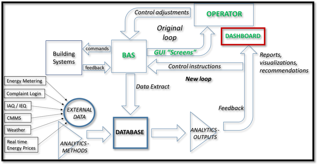
Figure 2: Capstone project context
Source: Bobker, 2014
Dashboard middleware is a larger aspect of information technology and computer science engineering; as such it is beyond the scope of our project to develop the middleware that will be actually needed to build the dashboard. For project purposes, dashboard architecture can be explained through the operation of what might be thought of as an “early telephone exchange breadbox model.” This model consists of three stages – input, processing, and output. As the name suggests the input stage receives commands from multiple data streams such as the BAS, energy metering systems, facilities management functions such as security (for building occupancy), weather sources, computerized maintenance management system (CMMS), occupant complaint logging systems; etc. Input stage gathers and transfers the information to the processor where data from separate streams can be integrated and processed into analytics through performance and other metrics and prepared to be transferred to the output stage where the processed data is transformed into usable information and displayed through multiple channels such as dashboard – an operator human machine interface, automation central computer, mobile services; etc.
Processing component of a “telephone exchange breadbox model” is equivalent to dashboard middleware and it can be explained further through middleware operation. A middleware consists of three sub-components which perform data sourcing, data formatting for interoperability and analytics. Data sourcing receives raw data from physical or data layer from multiple channels and combines them together for data formatting and analytical operation. Data after analytical operation is converted into usable information and sent to the output stage to be presented to the user through presentation layer. This presentation layer includes multiple channels such as BAS, energy dashboard, mobile devices; etc. The diagram below explains the working of “telephone exchange breadbox” with middleware components.
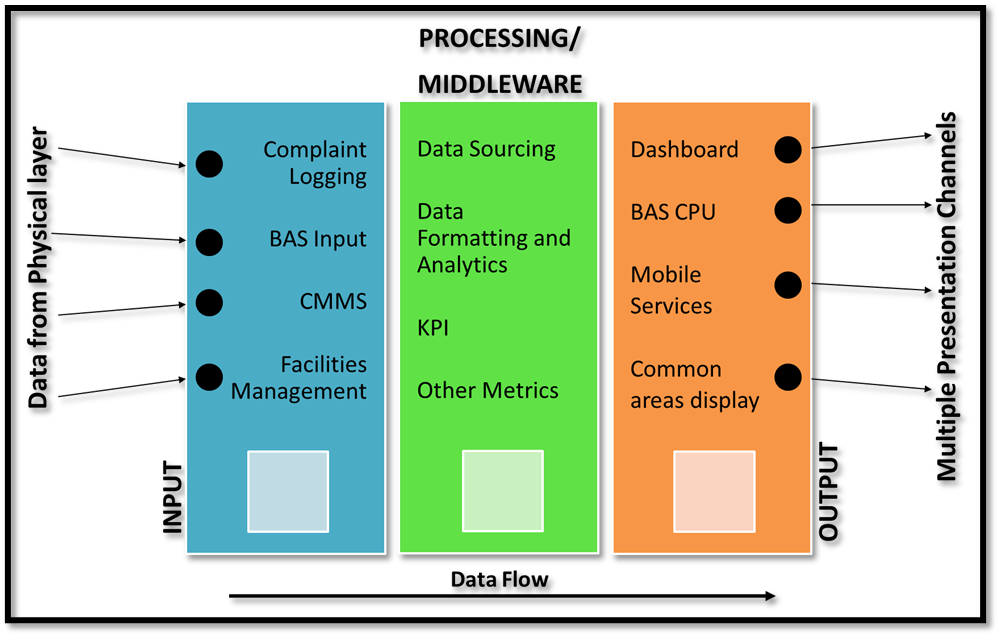
Figure 3: Working of a telephone exchange breadbox with middleware operation.
Commercial buildings can be energy intensive and within these buildings there are four major categories that consume most energy such as office equipment and lighting, cooling system demand, heating system demand and energy for pumps and fans (Korolija et al, 2011). The HVAC system consumes a large part of the energy used in buildings (Pérez-Lombard et al, 2011), and twenty percent of this energy is often wasted due to poor management and deviations from original design (PNNL Building Re-tuning, 2015, Zheng et al, 2011). Identifying energy waste in a building can be challenging because the energy flow is usually invisible. Building Automation Systems can address this challenge by presenting a whole-building detection and performance system. This system can acquire energy information via individual meters and sub-meters. A building can conserve 5-30% of its energy expenditure by using fault detection and diagnostics (FDD) (Zheng et al, 2011). The diagram below by Zheng et al, 2011 explains real time energy data acquisition and diagnostic system for an energy dashboard that collects data from multiple channels and provides actionable information to the user.
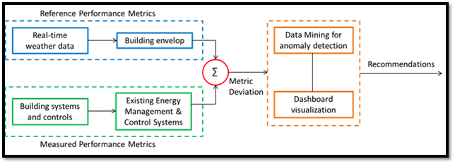
Figure 4: Real-time energy data diagnostic system
Source: Zheng et al, 2011.
The options to reduce building energy consumption include updating the HVAC system with less energy intensive equipment or by using renewable energy (Pérez-Lombard et al, 2011). It has been suggested, also, that it is possible to get better performance from existing HVAC systems at significantly less cost than either of these two options and is, therefore, an important and desirable first step (PNNL, 2015).
PNNL presents a low-cost alternative to achieve energy saving through the application of building retuning measures. It has been found that most of the energy waste comes from improper operations and to physical related issues such as leakages, dirty filters, etc. The energy savings opportunities can be achieved by identifying these incorrect procedures within the building. Building re-tuning involves a physical inspection of the building’s equipment and the analysis of BAS data based on time series trending. Buildings which already have applied these measures were able to reach up to 20% in energy savings (PNNL, 2015).
Building retuning is considered as an ongoing process, therefore, needs to be performed continuously to achieve better results (PNNL, 2015). The overall process of Building Re-Tuning is summarized in Figure 5.
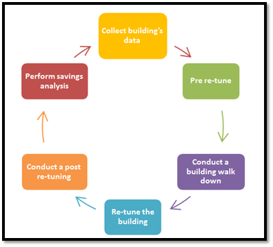
Figure 5: Process of Building Re-Tuning
Source: Adapted from PNNL, 2015
Measuring and benchmarking a building’s energy performance is essential for improving building efficiency. The building automation system (BAS) includes monitoring software, data acquisition hardware, and communication network to display building energy information. BAS can offer energy savings through simple tasks such as equipment scheduling, and other control sequences designed for energy efficient operations. BAS acquires data from sensors, meters and sub-meters (in buildings that integrate the building’s energy metering system). Middleware processes this data and presents building energy information on the energy dashboard. An energy dashboard might include a building’s load profile, baseline, benchmark, system irregularity; etc. Dashboard can provide building energy updates in analytical and graphical format (Granderson et al, 2010).
BAS can help detect mismatch within the equipment output and status. The alerts within the automation system can be programmed by rule-based detection or history-based detection. An alarm should provide information and context and display specific parameter with real-time measured data from remote location to the energy dashboard (French et al, 1991). In addition, BAS has the ability to monitor various parameters and acquire large amounts of data controlled from a central computer. Reporting an alarm can be challenging as there are several parameters, and each parameter can be reported as a “minor alarm”. Repetition of minor alarms can overwhelm the operator, and true alarms might go unnoticed. It is essential to distinguish the important ones for efficient reporting (French et al, 1991) (Capehart et al, 2014).
BAS consists of a control-based system architecture that connects computer applications to the remote devices. It is used to operate, monitor, and automate various electro-mechanical building systems and sub-systems that are hard-wired, wireless or connected through the internet. They use a common communication protocol and provide remote user access. BAS architecture is developed and deployed as various objects connected across networking channels. Object attribute and data is stored in the system and displayed on a central computer (Gloudeman et al, 2000). BAS is a robust configuration of fixed or customizable programs that are interconnected to receive, store, process and send building information. (Richards et al, 2011). BAS is controlled by a processor that serves as a common platform for monitoring and operating various hardware such as HVAC, lighting, alarms irrespective of their scale and arrangement (Fukunaga et al, 2000).
Communication protocols such as BACnet and LonTalk allow interoperability of devices and interface gateways stop and send data from one server to the other. As per Budike et al, 2011, the central computer is connected to various equipment and devices that store, retrieve, and diagnose data through sensors and energy meters. The energy dashboard has a main control screen that is connected to multiple sub-screens through interface gateway. Multiple screens can display different parameters such as data points, performance, consumption[4]; etc. (Budike et al, 2011).
Energy dashboard is an interactive display tool connected to the building automation system for presenting utility consumption, equipment condition and occupant comfort of a building. The dashboard may have one or more screens to display energy consumption, periods of consumption and other information. The data is displayed in terms of hours, days, weeks, months, quarters, or years. Other screens can present data points, weather data, space occupancy, data analysis; etc. (Foslien, 2013). According to Smith et al, 2001, an enhanced BAS should be modular and consist of a smaller set of commands and processes to control the applications (Smith et al, 2001).
BAS can send alerts through the monitoring software for advising system efficiency and detecting system anomalies. The system triggers “energy alarms” when the received sensor data is outside of the programmed parameters. It sends these alerts to the building automation and energy dashboard to be viewed by the building engineer. These alerts can be transmitted through local security panel to an offsite monitoring center and re-transmitted to the building automation system through the Internet for remote monitoring and controlling (Behnke, 2007).
A dashboard summary is a collection of data in an analytical or graphical format that allows users to view the building systems. However, understanding the reason for building’s performance might require additional investigation such as “drill down” in the building automation system. The goal of this summary dashboard is to offer decision support to the operator. The energy dashboard integrates multiple data points with key performance indicator metrics and provides an overview of the building information. This overview can be drilled down to obtain detailed information through key performance indicator highlights. The drill down offers analyses and interactive automation changes. The dashboard presents users with snapshots of real-time data to perform efficient decisions promptly. Overall, the research indicates that “there is a need for enhanced reporting and configuring of the building summary dashboard” (Foslien et al, 2010).
The BAS has some remarkable features that can be used to identify building performance. However, these systems also provide a massive wave of information that may limit operators’ understanding (Burns, 2005), and produce a phenomenon called information overload[5] (Van Gorp, 2015) (Yigitbasioglu and Velcu, 2012). Hence, several studies have been made to understand BAS use and the user perspectives. Burns gathered fifty-four facility managers and energy managers to understand their necessities and primary concerns about BAS use. Findings of these projects include users incapable of understanding sophisticated systems, and more interested in having systems capable of providing smart solutions rather than having lots of raw data (Burns, 2005).
Bobker et al. analyzed the interaction between building automation systems used and operators. Findings from this project identified BAS constraints in presenting information, whether for the lack of data storage or controllers/sensors. They recommended turning data from the BAS into actionable information in order to be most useful for operators. Moreover, building retuning measures require an analysis of time-series data to re-tune commercial buildings. This study found that with an appropriate training, operators can understand data analytics (Bobker, 2014). CUNY BPL proposes to improve BAS with the following considerations:
- Enhance/increase sensor’s capabilities to get richer data and to improve building’s control.
- Present automated analytics.
- Improve data storage.
- Increase end user satisfaction through better human-machine interfaces.
- Simplify BAS design (Bobker et al, 2012).
The first step is overcome current BAS communication issues and enhance data visualization. However, the BAS is only one component of building management. Further steps require training operators to use new software, as it has been being found in Burns’s study, operators’ complaints regarding not being fully trained to use advanced BAS (Burns, 2005). Ultimately, there is no need for a high-tech solution to address BAS-operators interaction (Burns, 2015), but rather, improvements in the way which the information is displayed in the system to enhance the ability of operators to use it.
Building Automation Systems (BAS) provides various data from the building, which at first glance may not be helpful to building operators (Doukas et al., 2007). Key Performance Indicators (KPI’s) are considered a cornerstone of an energy efficiency plan as they are capable of catching useful information from any collection of data (Van Gorp, 2015). Hence, KPIs can simplify a lot of data and represent it in one single metric.
Key Performance indicators should assist users by providing helpful information for decision-making in a simple to use format, allowing the comparing and contrasting of data, and providing reliable data for identifying specific issues (Alwaera and Clements, 2010). Furthermore, Paul Reale from BPL – CUNY recommended designing KPIs that enhance the operator’s understanding of how to improve building comfort and performance. From his point of view, the KPI should represent more than BAS issues and should help operator identify conditions for optimizing building’s performance (Reale, 2015).
Therefore, HVAC system KPIs are an important factor to achieve both occupant comfort and energy efficiency. Hence, the main goal of a KPI is to give useful information to increase the building’s efficiency (Doukas et al., 2007).
KPI’s also could pave the way to create sustainable buildings. Intelligent buildings require KPIs that apply the basic framework of sustainability. Indicators that facilitate the inter-relationship between (Alwaera and Clements, 2010):
- People (Owner, occupants, and operators)
- Products (HVAC equipment, automation system, facilities)
- Process (Maintenance, performance, and management).
A critical factor in designing KPI is to determine the group for whom KPIs are going to work effectively and efficiently. Within building management, we can identify three general working groups – technicians, management staff, and the executive board. The first group cares about the daily activities – mechanical performance, emergency calls, system monitoring, and attending complaints. The second group typically cares most that work is completed in an efficient way. The last group, the executives, look most closely at finance and high-level performance trends (Gilmer, 2015). Therefore, KPIs have to be designed considering the different levels of information and hierarchy. Shadpour and Kilcoyne (2015) suggest criteria for building automation dashboards at four different levels of dashboards for different users. Although, they did not specify any KPI’s classification, they defined the necessity of presenting data at different levels within the organization (Shadpour and Kilcoyne, 2015).
Although literature on dashboards and HMIs associated with building operations where multiple data sources are compiled into one interface is virtually nonexistent, there is a wealth of discussion on data visualization and information display in general, as well as in the context of operations HMIs. The CUNY Building Performance Lab and colleagues have documented the disparate nature of building automation systems and the need for standards both within BAS functionality and for the dashboards that display data and inform operator activities (Bobker and Paaswell, 2014). Our literature focus has been on determining the visual qualities that, when employed, will result in optimal display for improving operator workflow and encouraging the use of energy saving measures.
A preeminent thought leader on the matter of data visualization is Edward Tufte, whose book, The Visual Display of Quantitative Information still serves as a roadmap for those working to design improved methods for information visualization. Tufte’s key tenet is described as graphical excellence, “complex ideas communicated with clarity, precision, and efficiency… which gives the viewer the greatest number of ideas in the shortest time with the least ink in the smallest space” (Tufte, 1983).
Stephen Few, in his Information Dashboard Design, calls upon many of Tufte’s principles as guidelines for successful information visualization. Few focuses specifically on the dashboard, a single screen that is a “visual display of the most information needed to achieve one or more objectives which fits entirely on a single computer screen so it can be monitored at a glance” (Few, 2006). In addition, Few asserts that dashboards must have concise and intuitive displays, should be customizable and must contain information that is actionable. Few also categorize the types of dashboards as strategic, analytical, or operational. He lists thirteen dashboard design mistakes he has encountered in his study of dashboards, and among them are: introducing more than one single screen[6], choosing deficient measures (or KPIs), arranging data poorly, highlighting important data ineffectively, misusing color, designing unattractive visual displays and several others, which we have observed in BMS interfaces currently used.
Bill Hollifield and Dana Oliver’s guide, The High Performance HMI Handbook has been an invaluable resource for best practices of HMIs that are used in the industrial operations which are most similar to our own building operations. Where Stephen Few’s examples focused heavily on executive management dashboards for business data, Hollifield and Oliver provide excellent examples and processes around building HMIs for operational (rather than reporting) purposes.
Hollifield and Oliver start out with the assumption that many HMIs in industrial operations have been built out of Process and Instrumentation Diagrams detailing the functionality of the plant, with operational data sprinkled in. Additionally, the authors have observed that HMIs encourage operation based on alarms – if the system generates an alarm, respond to it. Otherwise, business as usual. This paradigm not only creates situations that are reactive rather than actively encouraging proactive course correction but can lead to inefficient operation with missed opportunities. Our philosophy on alarms is covered in the section on building operations best practices.
The authors note that in instances where traditional HMIs were replaced with high performance interfaces following their principles, abnormal conditions were recognized early on and resulted in improved resolution time and a higher success rate. Essentially, the high performance HMI allows operators to anticipate problems in advance of alarms, rather than responding to alarms when they occur (Hollifield and Oliver, 2008).
Experienced building operators can often address issues and respond to emergencies very well even in the absence of a high performing HMI. Their experience with the plant and prior exposure to abnormal situations has created an ability to act without this display tool (Crandall et al, 2006). Ideally, the high performance HMI will go above and beyond the most experienced operator’s capability to display information and provide actionable tools. However, in order for us, the designers, to build this tool, we first need to understand the operators’ goals and mandates. Before we devise an HMI to help them do their jobs, we need to learn not only what their job is, but how they currently perform it. Working Minds details the framework for Cognitive Task Analysis, the method whereby we observe, document, and recreate the operator’s mental processes as they do their jobs (Crandall et al, 2006). We seek to model the “naturalistic decision making” in our HMI. We have utilized some of the tools Crandall et al have outlined in this book in order to understand building operators’ tasks, build out KPIs that mirror them and create display propositions that clearly provide actionable tools.
Working Minds gave us a framework for organizing our process of learning about building operations and allowed us a structure for determining what aspects of the HMI are important.
The current project includes a series of steps from literature review to a mockup development of a final product. Our capstone project was carried out in two major phases – survey phase and design phase. The first phase developed the framework of our project through academic research, review of existing BAS market and building operator’s interviews. In order to enhance our research, we also developed a case study at Empire State Building. This case study helped us to understand the operator’s activities and behavior while dealing with one of the most outstanding buildings of Manhattan.
The first approach began with an extensive research of the academic literature and concepts within our project’s scope. Our team started by looking at technical books to enhance our knowledge of HVAC systems, automatic controls, BAS communication, human-machine interface, and data visualization. After that, we focused on academic papers and researchers that help us to address our topic; we were able to identify several projects within our scope.
Burns[7], Bobker[8] and BPL-white papers were a valuable source of our research as they highlighted the importance of the development of our project. Furthermore, Few[9] and Hollifield and Oliver[10] provided us with guidelines to enhance data visualization and improve the human-machine interface. In addition, our team also focused on understanding how the system would have to work behind the final product (Dashboard).
Data collection and flow in energy dashboards was also added as part of our project’s scope as well as the identification of BAS architecture and communication. This final part closed the loop of our academic research and allowed the team to understand basic principles to be incorporated into our final product.
The next step was to identify existing methods of data display. Therefore, we looked at various building automation and dashboard modules available on the market. Currently, BAS market is crowded with several companies, all of them claiming to make building management easier by providing useful data at real time. BAS market offers a wide range of possibilities to control buildings. In addition, some companies provide dashboards to control energy in buildings.
This company sells a dashboard called BuildingOS. This dashboard provides real-time data to identify operational opportunities for building’s control. However, the data in this design is displayed in the form of widgets, which requires further drill down and do not provide useful information at first glance. This dashboard was developed for more than one type of customer, so the level of details depends on the further drill down of the user. This dashboard also allows occupants to see their energy use within different periods of time (Lucid, 2015).
Iconics presented a dashboard that provides real-time information on one screen. It does not have identified apps as BuildingOS, but it has drill down features to display the information according to the viewer’s need. One of the interesting feature of this dashboard is that it can monetize energy usage data, which may influence operational behavior. Iconics also developed software called Facility AnalytiX. This dashboard is a step closer to target building’s operator. This system has a fault detection and diagnostic technology, which works as a doctor that diagnostic the building performance and can advise when there is a high probability of system failure and prevent faults before it occurs. Another software called Energy AnalytiX is used to track energy in buildings. Both are good approaches; however, the operator needs to switch between different screens to get the complete information of the building (Iconics, 2015).
This company designed a software called Time-lapse part of WebCTRL system. This tool allows operators to see real-time data as well as look at its history up to 24-hour slice. It also allows operators to see floor plans, equipment, trending, and alarms from past periods to identify and solve issues. The design provides information with drill down feature (Automated Logic, 2015).
This company offers a BMS called Metasys which helps to manage HVAC equipment on a single platform. It also has a drill down option and provides operator real-time data (Johnson Controls, 2015). Furthermore, other software called Panoptix has been developed to provide historical trends as well as failures of the system. This software desires to help operators to understand their building performance. Panoptix pulls data from the existing building systems –not necessary Metasys- and with a range of applications it delivers control of energy use, equipment operation and occupant comfort (Johnson Controls, 2015).
They launched the software called StruxureWare. It is a widget based dashboard, and it can provide information from multiple buildings. However, this dashboard displays information for high-performance buildings, which include CO2 emissions, energy savings, and others (Schneider Electric, 2015).
Once the current market was analyzed, the next step taken was to interview building operators. Some field visits were scheduled on our agenda. We talked with building engineers to get familiar with their daily tasks and find out ways to improve their performance. Our aim was to understand user experience, usability, and limitations of the existing tools. In addition to that, part of the team started internships at the CUNY Building Performance Lab and at Johnson Controls. These spaces, as well as the facilitator’s endeavor, allowed the team to get in touch with building operators and BMS in operation. The team visited CCNY’s central plant, John Jay College, and the Empire State building to familiarize ourselves with the current state of play of operators.
Our team also visited the chiller plant of City College – CUNY. This visit helped to recognize HVAC equipment and the BMS system utilized in this facility (Automated Logic). The team was able to understand the process of data collection from BPL. The BAS system used at City College was simple and only capable of providing trending graphics for short periods of time. For that reason, BPL collects data periodically. The John Jay College was the second place visited. Here, the team was able to familiarize with its BAS software from Siemens. We looked at the basic functionalities that this system provides. Siemens has a friendlier interface, and BPL staff mentioned their preference for this system due to its features and capabilities.
Both City College and John Jay needed frequent data collection, as their systems were unable to store data for longer periods of time. Our team had a limited exposure to operators in both places. Nonetheless, these experiences helped us to understand the physical and digital world behind dashboards. Hence, we decided to approach another building but focusing on interviewing a group of operators and developing a case study. The team interviewed the main operators from the Empire State Building.
Our design phase involved bringing together all our findings to develop a working prototype of an energy dashboard that serves our selected users. This mock-up is our proposal to enhance dashboard visualization. This process included the identification of the information that might be helpful to assist operators in their daily tasks, as well as the appropriate visualization to reduce common BAS issues such as data overload.
As this particular group needs to process lots of data in short time, we incorporated the basic concept of KPI and visualization. From our perspective, this step was the most important for our project, as we put together all the information collected through research and interviews.
We developed eight versions of our muck up. Most on the changes were based on refining information to provide clear information. The focus of this step was to avoid constraints in understanding the main dashboard. In addition, we carefully took in account if the information could be pulled from different sources.
We did not test this mock-up with operators, but we hope that this step can be done in further investigations. The next step will be to present it to operators to get its feedback.
Our project team had the opportunity to speak with members of the Empire State Building operations team including Assistant Chief Engineer Jim Rose and Operator Peter Tiscione. We had devised a set of questions designed to elicit their daily use of the BMS platform installed by Johnson Controls and identify opportunities where improved dashboard design might facilitate their operations and daily goals.
Utilizing the Cognitive Task Analysis methodology from Working Minds, we created questions around the tasks operators perform and what improvements might facilitate their work. Based on our own experiences working with and learning the BMS, we expected our findings to include comments on cluttered screens, extraneous data, excessive drilldowns, and unneeded equipment diagrams. Our expectation was that building engineers would report having a hard time identifying reported problems within the BMS and not having clear, concise information based on building performance.
From the start of our interview, it became clear that the Assistant Chief Engineer does not spend much of his time looking at the BMS – he has been set up with mobile alerts to his cell phone and responds primarily to two kinds: equipment issues (often leaks) and occupant comfort requests or complaints. He then uses the BMS to identify the adjustments he needs to make. For occupant comfort requests, he relies on the mobile alert to identify where the occupant is sitting, and occasionally needs to request additional information. For equipment issues, he uses the BMS to pull up the schematic of the equipment and looks over the indicators to see what might be happening. He also sends an engineer to the zone to physically inspect the equipment. This workflow made it clear that he uses at least two separate systems to accomplish one task. Our ideal dashboard will allow for the occupant comfort messages to be displayed on the dashboard which also includes data from the BMS to create a one-step investigation process.
In regard to equipment malfunctions, we were surprised to find that Mr. Rose likes the equipment schematic, which we had assumed would be extraneous, and actually advocated to add the pipe diagram to the BMS screen so he could better diagnose equipment issues.
From our interview, it became clear that the energy use in the building is not the building operations team’s primary concern. They have a mandate to address occupant comfort and to ensure the equipment is running well/address equipment issues. They rely on Johnson Controls to set energy use parameters in the form of set points and allowable changes – we imagine that should there be questions around increased energy use, occupant comfort would be an acceptable reason.
Mr. Rose is also responsible for responding to and reducing the building’s peak electric demand when the building receives a demand response request. When he gets the call from the energy company, his top priority is to quickly reduce demand. We are not clear that the BMS allows for indicators and actions to facilitate this. A dashboard module that recommends actions based on current building performance would allow for efficient setting back of equipment.
From our discussion with Mr. Tiscione, who looks at the BMS more regularly, we learned that the team uses the BMS to adjust settings related to occupant comfort, like temperature thresholds within specific zones or thresholds related to specific air handlers. The team has learned which areas of the screen to look at to find the settings they need to adjust and are comfortable with using the screens. They also have a handwritten BMS log where they track BMS issues – this is something that could be coded into the BMS as a “service log” that may save them time with pre-inputted dropdowns for the issues that are found repeatedly, the majority of issues. The person sitting at the BMS screen also has a mandate to scan each floor’s screen and look for potential issues. This task could potentially be made easier with a dashboard that summarizes a list of places that are returning readings outside of a set threshold, rather than asking the engineer to click through each one-by-one.
Johnson Controls is currently performing an Energy Performance Contract (EPC) as part of the Sustainability Program at ESB and has installed five Energy Conservation Measures (ECM) within the building. Besides these activities, a new software was implemented to be used by operators, management staff and tenants from the ESB. Panoptix is a new interface that uses data from their current BAS (Metasys) and allows operators to see trends of the system performance without limitation of time series. This system displays failures of the building systems at different urgency categories.
Operators were exposed to this new software at the beginning of the summer. To our surprise, operators did not show a good response in using another system that may improve their performance. We were not able to identify if the reason for the resistance to using a new program was, for example, perceived as the addition of a new load to operator’s daily tasks or because the new tool did not in any clear way help compliance with the guidelines provided by the chief engineer and his assistant ( keep occupants happy). The watch engineer, who could theoretically use the new system to improve his job performance did not present any response, as his job is to look at BAS and to search for mismatches or failures in communication with the system.
Johnson Controls is aware of the lack of usage by operators. However, according to Daniel Berry (responsible for Panoptix development), Panoptix constitutes a helpful tool in other buildings. Mr. Berry, who has a long history in BAS, highly recommends that the information presented on BAS screens should be associated with a cost for recommended action. According to him, the development of new BAS should not focus on presenting better graphics or designs, as there currently exists a large market of products through which users can choose designs which make them feel comfortable. For him, the next generation of BAS is capable of providing the “right” information for different users.
Johnson Controls and ESB staffs have made huge efforts in reducing the energy consumption at the ESB. However, the largest, most important tenants can control their own AC systems, having them running 24/7. Panoptix and its energy portal might help to reduce the energy waste, as this portal allows tenants to view current energy consumption in kilowatts, compare it to historical consumption and compare their consumption about other tenants who are under the same ownership structure.
Overall, it was difficult to gauge the potential energy dashboard improvements we could implement in this space given that the energy use of the building was found to not be a top priority. We do suggest that integrating the occupant feedback system with the BMS will allow for faster complaint resolutions and reduce the need for follow-up on occupant location. We also found that labelling the physical equipment within the zones to correspond with the VAV within the BMS will greatly assist the staff in identifying which zone corresponds with which VAV. We suggest that a dashboard outlining the out-of-parameter readings on each floor will assist the engineer in his or her morning pass over the floor status. Additional business-as-usual task the engineers are responsible for may also be summarized in a dashboard.
We are not clear whether giving the building operations team a mandate to reduce energy use is compatible with their often competing mandate to address occupant comfort. If a building should decide to make them responsible for this, a dashboard predicting energy use given certain threshold changes (if we decrease the temperature in this zone, we will expect to save X kWh over X hours) would be helpful in informing their decisions. However, as their primary concern is keeping occupants happy, this may be a tool they do not use unless impressed upon to reduce energy use.
In building out our dashboard prototype, we had to decide which facilities management units would be looking at it in order to best anticipate their needs. Conceivably, everyone touching a facility might want to see data coming out of the BAS – property managers and landlords might want to see energy data, tenants might be interested in occupancy data, and building operators will want to see daily operational information. The variety within the types of data and the associated displays is vast and the organizational structure around who does what in managing a building is complex.
Facility management, also called property management or, building operations management, is the structure that enables the functionality of buildings through the “integration of people, place, process, and technology” (Cotts, 2014). Large commercial buildings require complex teams to ensure that the building is running well. Depending on the size of the building, its occupants, its ownership, and its status as public or private property, the operational staff structure will vary (Cotts, 2014). Facilities management professionals need skills to be successful not only in building operations and maintenance but also customer service, communications, project management and strategic planning (Cotts, 2014).
There are different levels of operational staff and management that consider some or all of these functions. The building management team may report into a company department, if the building owners are occupants and manage the operations internally or may report into a portfolio management manager if the building owner has outsourced the building management function. In either case, the building operators or building managers who are our target audience will report into a facilities management team that has multiple mandates. Figure 5 shows a “one location, one-site model” where there is a Chief of Operations and Maintenance Division staff member. The building operations team will roll up into this department.
Figure 6: Building organization structure.
Source: Cotts et al, 2010.
In considering our audience, we imagined that almost every stakeholder in the graphic will have cause to look at a dashboard that includes comfort, building equipment and energy KPIs. The administrative department might want to consider what portions of the building are occupied or unoccupied. The financial management team will want to consider energy expenditures and equipment capital investments. The operations team will want to know the buildings’ operational status. It turned out that there are multiple stakeholders with various needs in terms of the data that will best serve them as they perform their duties. In service to our goal to facilitate energy savings, we decided to focus our efforts on creating dashboard recommendations for building operators. These are the staff members that fall under the Chief of Maintenance and Operations Division in our graphic example. These building operators, sometimes called building engineers, are responsible for maintaining occupant safety and comfort while also ensuring that the building operations are in order (Reeves, 2015). They respond to occupant comfort complaints (my office is freezing!) and track the building’s energy performance.
Building managers are responsible for the smooth functioning of both residential and commercial buildings. They have multiple mandates and need to respond to issues in real time, rather than needing a reporting tool like the financial management department might use. Since building operators have the most hands-on experience touching and adjusting the “nuts and bolts” of the building, we decided to imagine our dashboard with them as our primary users. The dashboard layout and KPIs are designed to allow them to easily view data that is important to their daily tasks, and in so doing, to highlight opportunities where operators can reduce energy use while maintaining occupant comfort. Based on our discussions with building operators, we determined that they are a key audience who can benefit from a streamlined HMI tool that allows them to do their job more easily and to potentially contribute to energy savings.
Figure 7: Building Operations Hierarchy
One key attribute of our prototype dashboard and a cornerstone in our philosophy on building operations dashboards is displaying information that is actionable. The concepts of data and information are not interchangeable (Johnson, 2014). The BAS will be able to provide a plethora of data points on temperatures, set points, equipment status, and many others. The BAS dashboard is envisioned as a tool to facilitate the building operator’s job by displaying key information that is actionable. The role that the dashboard plays is to parse out and display data points in a meaningful way as information. For our purposes, data is considered the building blocks of our display; however, the time-frame, frequency, and organization of the data lends it the context that allows it to become meaningful.
Beyond our goal of organizing data so that it is meaningful, we also task our dashboard with the mandate to display information that is actionable. We consider actionable to mean information that either indicates that the operator must take an action or information that indicates that no action is required. For example, if we consider the ON/OFF status of a boiler, we would not consider the information of whether it is ON or OFF to be actionable by itself. We would want contextual information to determine whether the status is appropriate given other conditions. When informed of the contextual operational conditions, the operator will know whether this is a boiler that is ON that should be OFF or whether the boiler is ON and should remain that way, etc.
Before introducing the categories created for our dashboard design, it is important to establish the conditions at which our recommendations can be successfully implemented. Data from our dashboard comes from various software BAS, CMMS, and other programs [For details see section 8.4, data flow]. Within BAS we identified different modes of operation: unoccupied/occupied, cool-down/ramp-up among others. By properly using these modes, BAS can effectively reduce energy consumption. For example, A setback strategy is a proven energy-saving technique that allows equipment to run only when it is needed.
Our dashboard prototype provides information for managing building at working hours (occupied mode). Hence, BAS should provide a well-calibrated setback strategy where the equipment is set to run according to the occupancy schedule (working hours) with an acceptable time to preheat or precool zones.
Based on our research and interviews with operators; our team decided to present our recommendation of a dashboard with four main categories, below it is described each category[11].
The HVAC equipment performance is one of the primary concerns of building operators. A well-maintained system can achieve both thermal comfort and energy savings. The first activity among operators is to scan the HVAC equipment with the assistance of BAS programs. Hence, operators can determinate the system performance and make an adjustment to it, when it needs. Based on the operator’s daily task, equipment metrics must be a category to include in our dashboard design. Nonetheless, our goal goes beyond of tracking equipment performance, as this task is already achieved by using BAS. The equipment category presents operators with opportunities to take advantage of the system to achieve energy efficiency without compromising comfort. Re-tuning measures and predictive maintenance have been included as indicators to optimize the HVAC equipment, whether for energy savings or to prevent expenses due to equipment failures.
Ensuring thermal comfort for building’s occupants is another priority of building operator. Mainly, they respond to occupants’ complaints, even though, thermal comfort is very different between people; operators need to respond each complaint, as some of them rely on failures of the HVAC system.
Furthermore, a building must meet the minimum indoor conditions set up by ASHRAE standards. Failures in achieving such conditions will lead to occupant complaints and a waste of energy. This category is included in our design to provide operators a general understanding of the system performance, based on the accomplishment of temperature set point as well as the feedback provided by occupants regarding their perceived conditions.
From the literature review, we addressed the HVAC equipment as an energy intensive system in buildings. We assert that timely decisions by operators can save energy and reduce utility bills. Hence, tracking the energy consumption and demand is a fundamental category included in our dashboard design. Our core dashboard’s goal is to achieve energy efficiency by helping the operators to make accurate decisions. In this category, operators will be informed regarding the current use of energy as well as the historical energy consumption and demand of the building.
The previous categories are operators’ primary objectives. However, they need complementary information while controlling the building. Therefore, two sets of indicators were included into your dashboard: maintenance and reliability alerts, and external conditions. These indicators were considered because operators often switched from different screens to get all the data needed. We believe that having all the information in the same screen would help them to reduce time and improve their performance.
Table 1 below summarizes the indicators suggested in our dashboard.
Table 1: Suggested indicators
| Category | Name | Target | Description |
| Building Retuning Indicators | Air-Side Economizer
|
Reduce the necessity of mechanical cooling | When outside air conditions are favorable, the damper position from the AHU can be automatically placed to use the outside air. Favorable conditions: outdoor air temperature is 5 °F lower than the return air temperature, and the relative humidity is between 30 – 40%. |
| Chilled water supply and return temperature Delta T | Operate the chilled water system efficiently | The delta temperature between return temperature and chilled water supply should be not less than 8 °F or specify by design. Less than this threshold requires increasing the chilled water supply temperature setpoint to increase the delta T within the loop. | |
| Chilled water supply temperature reset based on OAT.
|
Operate the chilled water system efficiently | Use outside air temperature to reset chilled water supply temperature setpoint. A condition when this indicator should be applied is when outdoor air temperature is less than 60 F and cooling coil valve is open below 95%. DDC must increase the chilled water supply temperature setpoint, and open the cooling coil valves up to 95%.
A recommendation, not a rule, for changes of 4 degrees from OAT or a variation of 5% of the cooling coil; it should be a set point change of one degree in the chilled water supply. |
|
| Discharge-Air Temperature Reset
|
Operate fan efficiently | Meet a constant set point increases the use additional equipment whether to heat or cool DAT. This strategy requires an optimal reset-schedule of DAT-ST, based on internal conditions. The set point should be the average between of the warmer zones and coolest zones. | |
| Duct Static Pressure Reset
|
Enhance supply fan performance | Adjust duct static pressure setpoint according to the load conditions. It is important to look at the VAV damper position to increase or decrease the adequate pressure. Especially attention when VAV dampers positions are below of 30% or higher than 75% and the duct static pressure is constant during the day | |
| Hot water supply and return temperature delta T.
|
Enhance boiler efficiently | This indicator focuses on delta T between the hot water supply and the return temperature to prevent deficiency in the boiler. The hot water supply temperature setpoint (recommended at 20 °F) should be reset if delta T is below of 8 °F or specified by design. When delta T is lower than delta T set point, the hot water supply temperature should decrease by 2 °F every ten minutes. On the contrary, if delta T is higher, the hot water supply temperature should increase by 2 °F every ten minutes. | |
| Minimum Outdoor Air Operation | Used outdoor air properly | When airside economizer mode is not favorable to implement, the OAF needs to be compared with the OAD position. For occupied hours the position should be from 5 to 20% depending on the serving zones, and for unoccupied hours it should be close 100%. |
| Category | Name | Target | Description |
| Building Retuning Indicators | Occupancy Scheduling | Reduce waste of energy | This measure will alert the operator when the equipment is running at night (unoccupied hours) or different from the setback strategy. Additional time to pre-heat or cooled the zones will be part of this schedule too. |
| Supply and return air temperature Delta T | Enhance AHU performance | This indicator tells if the AHU is operating above or below the standards. The wrong operation of this system leads to unnecessary energy consumption. Recommended delta T from supply and return air temperature should be at least 8-10 °F. | |
| Waterside economizer | Reduce the necessity of mechanical cooling | This indicator takes advantage of the outside air temperature to cool chilled water from the cooling tower. This measure can be used when a chiller goes off, and the conditions are favorable. Favorable conditions: Wet bulb temperature lower than 55°F. | |
| Zone Heating & Cooling
|
Enhance AHU performance | This measure allows to control and to prevent the excessive reheat in zones, by identifying when the AHU is heating and cooling simultaneously. It will alert when interior zones are calling for reheat in summer. Increase the AHU discharge air temperature, close the zone reheat valve and reduce the minimum airflow setting by 5 to 10 percent. A recommendation is to check the zone reheat valves for leakage | |
| Predictive Maintenance Indicators
|
Mechanical Vibration Detection
|
Prevent equipment failures of all rotating equipment | This indicator analyzes vibration to identify potential issues that may require repair or replacement. The vibration measure is velocity (in/s). The threshold varies with the type of machine analyzed, whether it is small, medium, or large machine. |
| Infrared Thermography Detection
|
Prevent equipment failures of electrical and mechanical systems | This indicator identifies conditions that might decrease equipment through a temperature analysis. Large variations in temperature surfaces from HVAC equipment would mean possible failures. Small changes of temperature (10-40 °F) require to schedule an inspection, and when temperature rise more than 40°F equipment needs to be urgently repair | |
| Ultrasonic Noise Detection
|
Prevent equipment deterioration | Ultrasonic detectors can be used to identify problems through noise detection from component wear, fluid leaks, vacuum leaks, and steam trap failures. According to NASA, a 12-50x increase in the amplitude of a monitored ultrasonic frequency (28 to 32 kHz) can provide an early indication of bearing deterioration. | |
| Lubricant and Wear Particle Detection | Prevent compressor outages | This indicator uses oil analysis to give an idea of improperly performed maintenance or operational practices of the compressor or other machines with motors of 7.5 HP or larger. This analysis protects the cooling and refrigerant system from failures due to contamination. A regular report includes analysis of viscosity, moisture content, flash point, ph and present of contaminants. |
| Category | Name | Target | Description |
| Electrical Condition Monitoring
|
Prevent electrical equipment failures | This indicator uses an electrical testing for detecting faults within the system. Failures in electrical systems can increase demand of energy, potential safety concern (fires) and reduce the lifespan of equipment. It highly recommended monitoring the following parameters: temperature, resistance, voltage, current, phase imbalance, complex impedance, capacitance, insulation integrity, and mechanical binding. | |
| Indoor Environmental Quality Indicators | Occupant’s complaint | Track occupants’ complaints | This indicator tracks the occupants’ complaints from all the zones and the time interval when complaints are received. |
| Desired temperature | Track efficiency of HVAC | This indicator allows understanding the efficiency operation of the HVAC through the accuracy on meeting zone temperature set point.
|
|
| Energy Indicators
|
Demand | Reduce demand | This indicator tracks the energy demand based on the outside weather and predicts the demand pattern for the day based on the forecast. The goal of the indicator is to maintain a relative demand without hitting the highest demand of the building. |
| Energy consumption | Track energy consumption | This indicator allows seeing the daily electrical energy usage data of heating & cooling system, and the overall energy consumption. | |
| Maintenance and Reliability Alerts
|
Manual Override list
|
Reduce energy waste | This indicator will display the portions of the BAS that have been manually overridden by the operations staff. Hence, the operator will be able to identify the manual changes in the system. |
| Equipment Maintenance Calendar
|
Maintain proper conditions in equipment | Adequate equipment maintenance allows running the system efficiently, avoiding waste of energy, saving costs, and helping the equipment to last as its expected lifespan. The dashboard provides information of the most upcoming equipment’s maintenance scheduled. | |
| Equipment Outages List and Graphics
|
Alert failures in equipment | Knowing whether there is equipment that is malfunctioning is a critical part of the building operator’s responsibility. This indicator presents the current equipment outages that require immediate action from operators. | |
| External Conditions | Weather Conditions | Provide reliable weather data | This indicator provides accurate information about current weather conditions, to allow operators to adjust system settings due to the forecast weather. |
- Introduction
Dashboard is an important tool for monitoring building health. With the help of dashboards, building engineers get access to key performance indicators and actionable feedback that can enable timely energy efficient decisions. Dashboard is an executive intranet which logically groups and displays most important information from a cohort of complex datasets. Dashboard can display and track building’s energy consumption, equipment status, detect anomaly, identify energy wastage, occupant comfort and provide guidance to improve those areas (Wikipedia/dashboard, 2015).
An energy dashboard is an easy to read, real-time user interface presenting building’s current status in a snapshot to enable informed decisions at a glance. It is a web-based interface that shows the progress report which is continually updated. Typically, users see high level information on a dashboard and drill down for granular data. The information is designed to be displayed as graphics, gauges, and summaries to highlight important information (Wikipedia/dashboard, 2015).
An energy dashboard is an interactive display tool that is presents a building’s energy information and building system status on a computer screen to the building engineer. The energy information is acquired from building’s remote devices that are hard-wired, wireless, connected through phone or internet; etc. The building automation system brings together all the building systems to be monitored and controlled remotely from a central computer. The information from these devices travels through three tiers of communication architecture – presentation layer, business layer and data layer. The diagram below explains three tier communication architecture. [For layers in detail refer appendix section 15.3]
Figure 8: Three tier communication architecture diagram
Presentation layer is the front-end of dashboard engineering and data layer or the field layer is the back-end support. Front-end is the interface that is visible to a user and there are numerous layers between the front-end and back-end. Front-end simplifies the underlying analytics for a user friendly interface. Front-end is a client component which is manipulated by the user and the back-end acts as a server establishing client-server interaction (Wikipedia/font-end, 2015).
For an energy dashboard, the graphical user interface or the graphical file manager serves as the front-end desktop environment that interacts with the operating system and field layer. The dashboard is placed on the “inward-facing front-end” of the network communication traffic where the user requests information from the middleware. Dashboard back-end is the source for code programming that runs at a faster pace than the front-end and optimizes data for viewing (Wikipedia/font-end, 2015).
Presentation layer works to identify, locate, manipulate, format and present data in an optimal way to be understood by the user. It discovers valuable information from all the data and makes it user friendly, relevant, and actionable through data visualization. The role of a presentation layer is much more than just data visualization, it identifies important information on desired time and choses the best way of presenting it. The presentation layer collects all the front-end information by coding them in a specific module to be processed by the middleware (Wikipedia/Presentation, 2015).
Middleware is a computer system that mediates between engineering front-end and back-end. It is referred to as “software glue” that connects software applications to the physical components. This layer lies in between the operating system and the distributed network. Typically, middleware includes “web servers, application servers, content management systems, interface gateways; etc. that manage development and delivery of the application.” It enables communication and management of data within distributed network. In simple words, middleware is any software that allows other software to interact. To be precise, “middleware is the dash in client-server.” (Wikipedia/Middleware, 2015).
Middleware provides services that are beyond the operating system and manages data by simplifying complex distributed applications. It enables interoperability to exchange data between different operating systems and applications. It is also known as the business layer in three tier architecture that stretches across multiple applications and systems. The distinction between a middleware and an operating system can be subjective as modern technologies have enabled the operating system to include middleware instead of having a separately sold middleware such as TCP/IP stack for telecommunications. Middleware comes in various types such as “message oriented middleware, object middleware, RPC middleware, database middleware, transaction middleware, portals; etc.” (Wikipedia/Middleware, 2015).
All software and hardware components of a dashboard data system are based on a chain of actors. Each actor takes care of a specific function. Some actors share a function. Dashboard data system middleware manages client-server architecture and provides data exchange between various software and hardware components. Middleware supports real time data and historic data access, data exchange, access to web, alarm notification; etc. (Bhatt, 2015).
Middleware supports all dashboard functions such as:
- Reporting status of all building systems under the BAS
- Reporting alarms
- Monitoring and controlling various devices and equipment through GUI.
- Maintaining a log of occupant complaints, upcoming events, and alarm history
- Controlling the systems remotely from a central computer
- Access to the internet
An energy dashboard receives data from the building automation system and various other programs that are installed outside of the automation system as per the client’s requirements and are presented together on the dashboard. These programs are displayed directly on the dashboard in a graphical or analytical format through internet, Ethernet, and interface gateway. Our energy dashboard acquires data from numerous sources at varying time intervals. It organizes this gathered information in a series of useful charts, digression tables, calendar, system graphics and time series that display various energy parameters. The energy information is collected from meters and sent through interface gateways to be displayed on the dashboard. All the data requested is stored in a central computer for further action.
Building’s total energy demand and equipment outage information is displayed in real time on the dashboard and rest of the information which pulls data from the building automation system or from independently installed programs is stored in a central processing unit and displays it on the dashboard at desired time intervals. Information from building automation system and independently installed programs is combined together to provide a thorough display of building energy and performance on the dashboard. (Marini, 2011). The dashboard will allow the user to control the systems by offering a drill down to the system level (Bhatt, 2015). Based on the functional hierarchy, dashboard architecture can be split into three levels:
- Management level
- Automation level
- Field level
- Management level – Whole building information is presented at the management level interface. Management level is used to configure and maintain a building automation system. The building engineer has access to all the building systems in the automation system and is able to manipulate the parameters. This level generates alerts for technical faults, system mismatch, critical condition, and system failure. Engineer can view building’s real time and historic data and is able to generate reports at this level (Bhatt, 2015).
- Automation level – This level assigns automated controls and operates based on the data received from the field level. It integrates data received from multiple sources and distinct types of data streams and then performs analytics that are fed to the Management level. It establishes logical connections and control sequences. The data is exchanged within various entities and is known as horizontal communication. In addition, this level prepares data for vertical access provided by the management level. Automation level stores building’s historic and real time data. Real time data transfer is done between field and automation levels and updated on management level at specific time intervals. This level allows communication within systems through single or multiple communication protocols (Bhatt, 2015).
- Field level – Field level initiates interaction with the physical world. It measures, counts, collects, and transforms data for further transmission and processing. In addition to collection, this level controls the parameters based on the commands received from the automation level such as setting, positioning; etc. Devices such as sensors, actuators and controllers installed at the field level are responsible for data acquisition and include control functionality (Bhatt, 2015).
- Types of information on an energy dashboard
The information displayed on an energy dashboard can be divided into three categories: operational information, simulation information, and fault detection information. Operational information is received from sensors, command signals, and control set points. This information displays the physical value with timestamp. Simulation information displays predictions of parameters such as temperature, pressure, flow, load, energy use; etc. as developed by various kinds of models and modeling engines. In case of fault detection information, the data gathered from the sensors is processed by the middleware to detect mismatch and failures within the systems and are reported on the dashboard as alerts. (Dong et al, 2012).
- Dashboard Architecture Diagram
Dashboard architecture consists of a dashboard display screen, a central processing unit, building automation system and various other programmable parameters that can be included within the building automation system or programmed outside of it. All the assembled parameters are connected through Ethernet, internet and interface gateways that send information to a central computer and dashboard when requested.
Figure 9: Dashboard architecture diagram developed by the capstone team.
- Setting up Building Automation System and Energy Dashboard
Typically, a mechanical engineer and MEP consultants design, specify and install the building systems and a control systems integrator builds out a control system and associated database. They install communication network between the building systems input and output devices and the central control system. The integrator develops control and monitor application programs based on the designed sequence of operations. After completion, the automation process is commissioned to check its workability and compliance with the initial design. The networking and communications specifications should be clearly written as per the client’s requirement. It should address hardware and software applications, system performance, communications protocol, and networking applications. The attributes of a system should be selected in a way that exceeds the design’s performance goals. The goal of the building automation system is to bring together different devices and systems and connect them in a given facility. Building automation system requires reliable infrastructure and network for transmitting data and presenting all building components to the user. However, in current practice all the building systems are not fully integrated in the BAS. The automation industry is slowly starting to move in that direction and the steps mentioned above for setting up BAS and energy dashboard is intended for advanced fully integrated BAS.
- Device inter-communication in dashboard architecture
The communication protocols allow the devices manufactured from more than one vendor to inter-communicate. BACnet and LonTalk are some of the widely used communication protocols in the automation industry. A communication protocol allows the devices to exchange information irrespective of the service platform they serve. Every vendor has a specification standard for their hardware that complies with building automation and the communication protocol supports communication between various vendor products within automation and overrides any connectivity issues and errors. BACnet and LonTalk are standard open protocols certified by ASHRAE, ANSI group and ISO 16484-5.
These communication protocols allow communications between HVAC applications, lighting, and fire safety services, building security and access and other linked equipment. Communication protocol can integrate more than one automation system and service platform. Accurate communication between building automation systems is crucial for optimizing building’s energy efficiency, indoor air quality, occupant comfort; etc. These communication devices offer system integration at the presentation layer which allows the users to combine devices from various vendors to achieve system-wide efficiency by providing a centralized comprehensive network. [For details on communication protocols refer appendix section 15.3].
For our BAS dashboard prototype, we are breaking with Stephen Few’s definition that a dashboard must all fit on one screen and we are including click-through drilldowns. Few recommends that dashboards be limited to one screen because humans are only able to store a limited amount of information in short-term memory, the mechanism used to see information and draw conclusions (Few, 2013). Our dashboard functions as an at-a-glance status screen that displays multiple components of building operations, only some of which may be related to one another.
Each component of the primary screen entails an action, and often, the actions of the building operators can require more information than is relevant on the “at-a-glance” screen. In this case, one of the actions we consider to be valid is to click into a drill-down to investigate further. Information on malfunctioning equipment, opportunities for energy savings and occupant comfort complaints all drill down into a secondary screen that displays additional information pertinent to this specific area.
We address the fleeting issue of short-term memory by adding pertinent information on the drilldown screen. Where additional information from the primary screen is needed, it is repeated in the secondary or tertiary page. In the primary screen, there is weather data, equipment status data and an alert screen for malfunctioning equipment. For instance, the operator needing to fix a broken pump does not also need to see upcoming weather data, therefore this is omitted from the secondary screen. If, however, the operator needs to decide whether to economize, then the weather data is relevant and is repeated on the secondary screen.
We strive to provide the minimum level of detail to allow operators to perform their tasks, without overloading with unnecessary data. This is in line with Few’s recommendation to strike a careful balance between providing sufficient granularity and ensuring there is not excessive detail. As far as data format, Few asserts that it should be detailed enough to be meaningful but not so precise as to require unnecessary attention (i.e., writing $5,897,009.76 when $5.9 million will do).
Visual design best practices include prescriptions on the use of color, shape and animation within dashboards. Edward Tufte also has prescribed methods for use of specific types of graphics in specific situations, for combining words with images, for including data descriptors, for treatment of the grid overlay and many others. Above all, he beseeches designers to convey as much information as possible in as little ink (for our purposes, pixels, as Stephen Few notes) (Tufte, 2001). Any ornamental features or unnecessary table or grid lines serve to distract the viewer and contribute to visual “noise” that obfuscates the communication of clear, concise information (Tufte, 2001).
Few and others (Hollifield at al., 2008) provide examples of dashboards that are include pixels that do not contribute information. Examples we may have encountered in our daily lives might include excessive and/or inconsistent color and unnecessary animation, like those suspicious popups that congratulate you for being the millionth visitor to a website. Dashboard designers must understand that this screen must be usable for many hours while minimizing eye strain. As such, the color choices must be muted unless they are to draw attention to some important aspect. When color is used to draw attention, it should be consistent in its intent: for example, if red means that a boiler is on in one area of the screen, it should not suggest that a chiller is malfunctioning in another area.
Similar restraint is recommended for animations – a visual animation should convey data that cannot clearly be conveyed otherwise. For example, we have seen dashboards that include moving fans to indicate that a piece of equipment is on. This animation does not give us an indication whether the given equipment should be on and also unnecessarily distracts the viewer. In the prototype dashboard we have built, we have not seen the need to include animations for any portion of our information, in favor of using some color, with restraint.
A critical component of any operational HMI display is the use of alerts that tell the viewer when something is not working as expected and requires immediate attention (Hollifield et al., 2008) In our experience observing building operators, we have seen building operators ignore alerts completely as the frequency and importance of the alerts was not relevant and we have seen them respond directly to critical alerts, which were comfort complaints and equipment malfunctions. The authors of The High Performance HMI Handbook insist that a dashboard that facilitates operation solely from alerts is not doing its job (Hollifield at al., 2008) Some of the operators we interviewed also had developed an expectation that the alerts they get would be much more frequent during system changes like in the morning and in the evening, and that these would likely be false alarms due to the status change.
Because of the inconvenience of alerts and the suggestion that a high performance HMI should be able to anticipate issues and identify remediation actions well ahead of an alert (Hollifield at al., 2008), we have done away with alerts altogether. There is a section of our primary screen that deals with alert-type issues including equipment malfunctions and comfort complaints, but these are not popups and they are integrated into other operational information. Additionally, for the data points where there is an alert-type visualization (red/yellow exclamation point), there are also leading indicators elsewhere on the primary display to allow operators to catch issues ahead of time.
Introducing any new technology into an environment that has previously functioned without it should be approached with care. In “Barriers to Adopting Technology for Teaching and Learning,” the authors found that the three main barriers to the use of new technology in a learning setting were as follows (Butler and Sellborn, 2002):
- Reliability: does the technology work as expected and work well
- Training: how long it takes to learn the new platform and become proficient in it
- Value: does the technology augment workflows already in place
If we extrapolate these findings to the facility management space, we are left with the imperative to introduce a dashboard that is reliable, easy to learn and provides added functionality and value.
Reliability: The dashboard must correspond seamlessly with its various data sources including the BAS, local weather reports, equipment maintenance schedules, occupant comfort reporting tools, etc. It must provide clear instructions for support and reporting of problems.
Training: The teams using the dashboard must have introductory training sessions as well as easily accessible in-tool documentation where they can find more information. There should also be a resource who has more in-depth knowledge of the tool who can provide additional information.
Value: The dashboard must have resounding buy-in from the audience that will use it, the operators. This can be completed during the build-out and User Acceptance Testing phase of the implementation where operators can get hands-on experience with the dashboard and see where it will allow them improvements to their daily tasks.
The variety of building operations setups and BAS functionalities is vast, as are the types of equipment prevalent within a building. Buildings in the same portfolio might have different layouts and equipment configurations but may utilize the same BAS and dashboard.
Given that various buildings will not all have the same equipment, it is important to allow for the dashboard to have flexibility in the items it displays. For example, the Equipment Metrics list consists of sample KPIs and equipment condition measures that may not be appropriate for all buildings. The dashboard implementation process will include the selection of pertinent ones.
In order to maintain visual consistency, different dashboard modules within an organization should keep the same color schemes as well as consistent color and icon indications. This will allow operators to quickly get up to speed on similar systems and allow for easier transitions within and among buildings.
Our dashboard displays a variety of building information – real time data, alarm notification and corresponding action, overall energy demand and consumption, system management; etc. We have mentioned an entire list of the elements on the dashboard and the source for the information displayed. All the information on the dashboard will be updated regularly except for peak demand and equipment outage indicators which will be displayed in real time for instant detection and action. Below are the screenshots of the two versions of our dashboard mockup. The first version, Figure 10, is our final product designed to be seen on a desk monitor and features lower contrast colors to reduce eye strain. The second version, Figure 11, was used for our presentation had had higher contrast black on white graphics for emphasis on a projector.
Figure 10: Building Operations HMI – low contrast
Figure 11: Building Operations HMI – high contrast (presentation demo)
Building comfort is the first set of indicators displayed on the left hand side top corner of the dashboard screen. This area is designed to give the operator an “at-a-glance” understanding of what floors are operating outside the rule-based thresholds and set points, and the active occupant complaints. This is an area that interacts with an outside platform, the complaint tool, as well as the BAS to allow the operator to see where there are active complaints and potentially predict where there may be complaints in the future (the floors with significant digression).
- Occupant complaints
- Visualization: At first glance, the idiot lights indicate where there is an active comfort complaint that has not been addressed and more than one complaint is activated. Clicking on the idiot light, the building engineer can drill down to see another screen that displays the floor’s readings by zone with more detail around the complaint (whether for being too cold, too hot or odor) as well as complaint history.
- Data source: Occupant complaints will be entered in a log through complaint log program which is an independent program and can be installed in the dashboard’s operating system. The occupants will require a login to register their complaint in the program which will be updated regularly on the dashboard.
- Consideration: Tenants need to have access to a third party program to provide direct feedback of their comfort, and operators also can access registering the complaint calls.
- Units: N/A
- Frequency of data collection:
- Default value and priority threshold default value: The idiot light will be activated in the main dashboard when more than one zone in the floor has complained.
- Desired temperature
- Visualization: This area displays all the floors in a building in a digression table that highlights the floors that are outside of the temperature threshold. The table displays the floor’s hierarchy with higher digression to the lower. Related information from this fault like percentage of digression, set point default and current temperature is also provided in the main dashboard.
- Data source: The data for digression table is received from the temperature sensors from the building automation system and formatted into tables to be displayed on the dashboard.
- Units: Degree Fahrenheit (°F).
- Parameters required: Temperature present value per zone, average temperature per floor, temperature set point and the percentage of digression.
- Frequency of data collection: Every 60 minutes
- Default value and priority threshold default value: The significant digression is calculated as a temperature reading that is outside the 2 F dead-band for more than 15% of the time over the past hour.
The second panel belongs to equipment metrics which has two sub-categories of indicators: building retuning measures and preventive maintenance. These indicators were considered to enhance the performance of the system and to prevent further equipment failures.
This area is an “idiot light” setup that serves two functions: to alert the operator about energy saving opportunities that are unrealized and to provide information on the functionality of equipment. This area is designed to not only display areas that may have faulty equipment but also to allow the operator to keep energy optimization under consideration throughout his or her daily duties. Idiot light color coding is determined by rules within the dashboard logic and their representation is described below:
- Green: there is an opportunity to optimize performance and this opportunity is currently realized
- Yellow: there is an opportunity to optimize performance and this opportunity is not currently realized. The operator should click the idiot light to reach a screen with more information and optimization suggestions.
- Red: the equipment is malfunctioning (for example: there is a leak, a pump is broken; etc.)
- Gray: there is no fault in the system and there is no opportunity to optimize performance.
- Building Re-Tuning Indicators
Building Re-Tuning KPI is based on the measures suggested by Pacific Northwest National Laboratory (PNNL) for efficient operation. The status of equipment, savings opportunity and faulty operation will be highlighted using color coded “idiot lights”. Data for Building Re-Tuning measures will be acquired from sensors and data loggers from the field level and sent to the automation level to be entered into .csv file format to be viewed using an excel tool through BACnet data acquisition tool. Each of these measures will be presented in a table and time series on drill down. This information can be created using excel tool or any other data visualization tool such as ECAM excel plug-in or Universal Translator 3; etc. This data visualization can be presented on the dashboard by importing the plug-ins from the operating system. Below are some examples of Re-Tuning Measures:
- Airside economizing
- Visualization: At first glance the user will see the indicator and the idiot light according with the colors previously established (red, yellow, green and gray). A further click will allow the user to see time series of OAT, RAT, ST, STSP and economizer trend (difference between RAT and OAT).
- Data source: Data will be acquired from sensors and data loggers from the field level and sent to the automation level to be entered into .csv file format to be viewed using an excel tool through BACnet data acquisition tool.
- Units: Temperature (°F).
- Parameters required: Outside air temperature, return air temperature, supply temperature, supply temperature set point, mixed air temperature, cooling coil valve position.
- Equipment required: Temperature sensors, valve position.
- Frequency of data collection: Every fifteen minutes, and the graphic will display a daily visualization of the time series.
- Default value and priority threshold default value: Optimal condition to economize are described in the table below:
Table 2: Economizing opportunities
| RAT= 74 °F and RA RH = 55% | RAT= 78 °F and RA RH = 55% | ||
| When OAT is… | Economize when OA RH is | When OAT is… | Economize when OA RH is |
| 74 °F | < 55% | 78 °F | < 55% |
| 72 °F | < 61% | 76 °F | < 61% |
| 70 °F | < 68% | 74 °F | < 67% |
| 68 °F | < 76% | 72 °F | < 75% |
| 66 °F | < 85% | 70 °F | < 83% |
| 64 °F | < 94% | 68 °F | < 92% |
| < 62 °F | < 100% | < 66 °F | < 100% |
| When OAT< SATSP, mix enough RA with OA to meet SATSP | |||
Source: Building Performance Laboratory, 2015
- Duct static pressure
- Visualization: At first glance the user will see the indicator and the idiot light according with the colors previously established (red, yellow, green and gray). A further click will allow the user to see time series of duct static pressure, duct static pressure set point, zone damper position and fan speed.
- Data source: Data will be acquired from sensors and data loggers from the field level and sent to the automation level to be entered into .csv file format to be viewed using an excel tool through BACnet data acquisition tool.
- Units: VAV damper position and fan speed (%), static pressure (inch WC).
- Parameters required: Supply air static pressure, supply air static pressure set point, room set point, room temperature, damper position, supply fan speed.
- Equipment required: Pressure sensors, VAV damper actuator.
- Frequency of data collection: Every fifteen minutes, and the graphic will display a daily visualization of the time series.
- Default value and priority threshold default value: VAV dampers positions below of 30% or higher than 75% and duct static pressure is constant during the day.
- Predictive Maintenance
Predictive maintenance KPI is the second category within equipment metrics KPI. This KPI will gather data from building sensors through building automation system and the “idiot lights” will highlight the equipment condition that needs to be addressed. This KPI offers drill down to building automation system for equipment fault detection and the building engineer can perform a building walk down to fix the issue. Below are some examples Predictive Maintenance:
- Infrared thermography detection
- Visualization: At first glance the user will see the indicator along with the idiot light. A further click allows the user to see a chart of the temperature analysis -comparison from last reading and current reading-. Additionally, a table will be provided with recommended actions when a significant difference is encountered.
- Consideration: Electrical equipment subject to control: transformers, motor control centers, switchgear, substations, switchyards, or power lines. Mechanical equipment subject to control: heat exchangers, condensers, transformer, cooling radiators, and pipes.
- Data source: Data will be collected from temperature sensors installed in equipment.
- Units: Temperature °F
- Parameters required: Equipment temperature at normal equipment conditions, temperature from current reading and the difference between both.
- Frequency of data collection:
- Default value and priority threshold default value: When temperature difference rise more than 10°F. The actions required based on temperature rise are:
Table 3: Actions Required Based on Temperature Rise under Load
| Temperature Rise | Action |
| 10-25°F | Repair at Convenience |
| 25-40°F | Repair at the next available schedule |
| 40-80°F | Repair at the first available time |
| > 80°F | Repair Immediately |
Source: Adapted from NASA, Reliability-Centered Maintenance Guide.
- Mechanical Vibration Detection
- Visualization: At first glance the user will see the indicator and the idiot light. If a red light is on, the equipment needs investigation. A further click allows the user to see a chart of the current reading versus the baseline vibration reading and a chart of ISO guidelines for mechanical vibration severity.
- Consideration: Rotating equipment subject to control: motors, pumps, turbines, compressors, engines, bearings, gearboxes, agitators, fans, blowers, and shafts.
- Data source: Data will be collected from sensors that quantifies the magnitude of vibration.
- Units: Velocity (in/s).
- Parameters required: Baseline vibration reading, current reading, and difference between both.
- Frequency of data collection:
- Default value and priority threshold default value: We will use a widely standard as a valid threshold the ISO guideline for machinery vibration severity (ISO 2372). First, the equipment is classified in four different categories (Class I, II, III and IV) within a range of severity levels (Good, satisfactory, unsatisfactory, and unacceptable).
Table 4: Range of vibration severity for different rotating equipment.
| RANGE OF VIBRATION | QUALITY JUDGMENT | |||
| Velocity –in/s | Class I
Small machines Motor up to 15kw |
Class II
Medium machines Motor 15 – 75 kw |
Class III
Large machines rigid foundation |
Class IV
Large machines soft foundation |
| 0.02 | ||||
| 0.03 | ||||
| 0.04 | ||||
| 0.07 | GOOD | |||
| 0.11 | ||||
| 0.18 | SATISFACTORY | |||
| 0.28 | ||||
| 0.44 | UNSATISFACTORY | |||
| 0.70 | ||||
| 1.10 | UNACCEPTABLE | |||
Source: Scheffer and Girdhar, 2014.
The third panel of our dashboard belongs to energy indicators located next to occupant comfort area. This area is designed to track building energy consumption and demand in real time and to project demand for the coming hours.
- Demand
- Visualization: This KPI is presented in a chart format and the table is available on drill down. This KPI shows hourly energy demand and the building’s peak demand derived from building’s energy history. This allows the operator to see where the building is performing compared to peak demand and to see temperature projections alongside this information. This KPI tracks the energy demand based on the outside weather and predicts the demand pattern for the day based on the forecast.
- Consideration: A panel to the left provides icons that reference suggestions for how to reduce demand should the need arise. The icons for the fan, light bulb and temperature respectively refer to opportunities to reduce demand by turning fans down, reducing light use and adjusting temperature set points. These icons will change depending on what portions of the building are under the operators’ control in a given facility management scenario. This KPI will alert the user as the current demand reaches the limit set for peak demand charges.
- Data source: The information for this KPI is gathered from building’s energy meters and sub-meters and populated in a table and chart using excel tool from dashboard’s operating system. This KPI can be created using BACnet real time data acquisition tool to create .csv files for viewing through excel tool from dashboard’s operating system.
- Units: Kilowatts (kW)
- Parameters required: Current kW demand, predictive demand, and peak demand.
- Frequency of data collection: Demand is tracked in real-time and is constantly viewed alongside the peak demand line.
- Default value and priority threshold default value: Alarm the operator when it is 20% close to meet the peak demand from previous year or season.
- Consumption
- Visualization: This indicator will allow the operator to see the monthly electric and fuel energy usage data. This KPI shows heating or cooling demand based on the season and shows the total energy consumption of the building that includes baseload, heating and cooling energy. This KPI is presented in a chart format and the hourly values are displayed and allows a drill down to monthly and yearly consumption. This time series displays the building’s energy consumption in monthly increments for the month thus far. It breaks these down by base load and HVAC (currently viewing heating).
- Data source: Data is gathered from building meters and sub-meters. Meter data is entered into tables to create chart using excel tool from dashboard’s operating system.
- Units: Kilowatt hour (kWh)
- Parameters required: Current energy use, heating and cooling use, and base load.
- Frequency of data collection: Every 60 minutes.
- Default value and priority threshold default value: n/a
The fourth and final panel will display decision-support information. This panel contains two sets of parameters maintenance and reliability alerts and external conditions.
- External Conditions
Since the operator’s activities and opportunities to create energy savings are heavily influenced by the outside temperature, we thought it would make it easier to have this information right on the dashboard.
- Weather Conditions
- Visualization: This indicator is displayed on the right hand side top corner of the dashboard screen. It provides accurate information on current weather conditions, to allow operators to adjust system settings due to the forecast weather. Weather conditions tab on the right hand side bottom of the screen displays live weather update for the day from the National Oceanic and Atmospheric Administration (NOAA) website. This shows the next 5 hours of local weather to inform the operators’ decisions around how many boilers/chillers need to be online, whether to economize; etc.
- Data source: As the dashboard is connected to the internet, daily forecast from NOAA website is displayed on the dashboard operating system.
- Units: Temperature (F), Humidity (%), and wind speed (mph).
- Parameters required: Current and forecast of temperature, humidity, and wind speed.
- Frequency of data collection: Every 60 minutes.
- Default value and priority threshold default value: N/A
- Maintenance and Reliability Alerts
These set of support parameters include a list of manual overrides, an equipment maintenance calendar, and the list of equipment outages.
- Equipment Outages List and Graphics
- Visualization: Equipment outages list is displayed on the right hand side below weather conditions. It shows a list of equipment failure with timestamp. The operator can click into the exclamation point icon to reach a schematic generated by the BAS to help him or her diagnoses and fix the equipment issue.
- Data source: The graphic is pulled from the building automation system that provides equipment type, zone, and floor details.
- Units: N/A
- Parameters required: Time and date of the current equipment fault.
- Equipment required: Status sensors.
- Frequency of data collection: Equipment outages KPI will be updated in real time as it will alert the user of any equipment failure.
- Default value and priority threshold default value: Only when equipment fails.
- Equipment Maintenance Calendar
- Visualization: Equipment maintenance calendar is displayed on the right hand side of the dashboard screen below the equipment outages. This indicator is a list of current and upcoming equipment maintenance schedule. This screen feeds from a maintenance calendar that is designed based on the building’s equipment profile. This calendar can be created in multiple ways and the icon next to the equipment list will highlight the equipment to be serviced on a given day. Clicking into the maintenance item will lead to a calendar that displays all of the items for the month and details the actions needed. [For equipment maintenance calendar examples refer appendix section 15.1].
- Data source: This calendar can be created through computer maintenance management system (CMMS) or within the building automation system and displayed on the dashboard or the maintenance schedule can be plugged-in the regular calendar in dashboard’s operating system.
- Units: Activity to be accomplished.
- Parameters required: Frequency of maintenance pre-defined by manufacturer or other reliable source.
- Frequency of data collection: Daily
- Default value and priority threshold default value: The HVAC maintenance schedule set by ANSI/ASHRAE/ACCA Standard 180-2008 or by the equipment manufacturer.
- Manual Overrides List
- Visualization: Manual overrides list is the last indicator displayed at right hand side bottom corner of the dashboard screen. As the name suggests this indicator provides a list of equipment override done and the details associated with each of them such as equipment name, location of the equipment – zone, floor, actual and the override value along with timestamp and overall runtime. The overrides displayed are the two most recently adjusted – a link at the bottom of this graph leads to a screen with all of the overrides currently in place. This allows the operator to view where the system may not be performing as well as required because the reasons for the overrides may no longer be in relevant.
- Data source: This list is created using the sensors from the building automation system such as equipment status on/off, occupancy sensors, temperature, fan speed, pump speed override; etc. that is entered in an excel table through dashboard’s operating system.
- Units: N/A
- Parameters required: Equipment, floor, zone, actual/override data, time and runtime.
- Frequency of data collection: Every 30 minutes.
- Default value and priority threshold default value: When
- Visualization: A question mark displayed on the right hand side topmost corner of the dashboard screen will explain the working of this dashboard and key performance indicators in detail for a new user. This section will also serve as an operator training module. User manual can be created in a word document through dashboard’s operating system and displayed on the dashboard when clicked on the user manual icon.
- Visualization: System Date and Time mentioned on the right hand side top corner of the dashboard screen will be displayed through the operating system on the dashboard. This tab will also display the current operating mode for the building such as heating or cooling mode, warm up or cool down mode, occupied or unoccupied mode; etc. This information will be pulled from the BAS.
Building operators have multiple and sometimes competing obligations: they maintain the safety and comfort of the building, the equipment within the building and they have a hand in adjustments that can result in energy savings. Often, data comes in from separate platforms and operators need to jump back and forth between tools to identify, diagnose and remediate issues. Complaints may come in through one platform, while equipment alarms come in through another. The benefit of building a dashboard that pulls data from separate sources is that it will allow them to see various data streams on one screen.
Based on our conversations with building operators, it is clear that for the people we spoke with, occupant safety and comfort is paramount, followed closely with equipment maintenance. Therefore, any dashboard that is implemented must consider comfort and equipment as key items that need to be prioritized. Ancillary goals like energy savings can be integrated within these key priorities so that they can be given attention. Integrating energy savings opportunities within the daily comfort and maintenance tasks of the operators will allow this goal to come to the forefront without overshadowing the main goals of comfort and maintenance.
In speaking with operators, observing existing BASs and building our own prototype, we have discovered a handful of key components that we believe should be incorporated into any dashboard designed to service a building with the appropriate equipment. These best practices are as follows:
- Compilation of multiple data sources: A dashboard should have the functionality to obtain feeds from various systems and centralize them in one space. If a building uses separate tools for occupant comfort and equipment alarms, these should be integrated into the dashboard alongside the BAS.
- Manual Overrides: Typically, the BAS is programmed for maximum energy efficiency. When its settings are manually adjusted, there is a risk for expending more energy than needed. This area allows for these overrides to be consistently reviewed and adjusted.
- Weather Data: Weather data is readily available and should be integrated within a dashboard and within a demand/demand response graphic.
- Actionable Information: The information presented within the dashboard should call upon the operator to do something or should confirm that he or she does not need to take any action.
- Clear Visuals: The visualizations on the dashboard should be clear at a glance and should not include excessive color or animation to reduce distraction and eye strain.
- Energy Consumption: The dashboard should include information on energy consumption along with recommendations to improve it. Since energy use is often, at best, a tertiary goal for building operators, having this information at the forefront will allow them to implement improvements easily.
Energy dashboards are a relatively new technology that offers potential for savings from their use. These savings can be achieved through timely reporting and efficient performance. A dashboard can be designed for various user groups and specific information has to be provided to the targeted user group. Dashboards should transform data into knowledge and knowledge into action. A dashboard is fed data from numerous components through multiple channels that measures data and presents the desired level of data granularity as requested by the user. A network of devices provides reliable data for analysis and reporting (Marini, 2011).
Our project addresses the need for better data visualization tool that is not being met by the current BAS tools. Our dashboard allows the user to access trends, drill down for details and track system anomalies by displaying the most important information without making the user navigate through multiple menus (Lehrer, 2011). Our recommendations for future work can be categorized into short-term and long-term goals. Short-term goal will involve expanding our efforts to develop a working prototype of our dashboard and testing it on the field. Long-term goal will involve designing a collaborative control system to accommodate occupant feedback to optimize comfort and energy savings opportunity (Song et al, 2013).
Short-term goal: Our year-long research indicated that building energy use and operations can be improved significantly through use of efficient data visualization tools that communicate important information to building engineers to enhance the performance of a building. As mentioned earlier in the paper, our project is a part of an ongoing long-term research being conducted at CUNY’s Building Performance Lab.
- BPL will expand our efforts by taking our graphical concepts such as “idiot lights” and overall dashboard content layout to the users through focus groups in this winter and spring of 2016.
- Based on the user feedback BPL will develop a final dashboard prototype and test its effectiveness on the field.
Long-term goal: In commercial buildings, control parameters for building systems have always been set by the building engineers and facility managers. Their primary decision is to meet occupant comfort followed by energy efficient measures. There has always been a trade-off between the two leading to missed energy savings opportunity or receiving occupant complaints.
- Our long-term goal recommendation is to assign some of the comfort controls to the occupants to optimize comfort requirements based on average values to achieve significant energy savings.
- This collaborative control system will accept occupant requests, detect issues and resolve conflicts for enhanced operation (Song et al, 2013).
The table below explains what equipment maintenance calendar might look like.
Table 5: Sample of frequency maintenance
| EQUIPMENT | ACTIVITY | FREQUENCY |
| Air Distribution Systems | Check control system and devices | Semiannual |
| Air Handlers | Check for particulate accumulation on filters and UV Lamp | Every three months |
| Check control system and devices | Semiannual | |
| Check for proper operation of cooling or heating coil. | Semiannual | |
| Boilers | Visually inspect fuel filter. | Monthly |
| Perform chemical testing of system water. | Monthly | |
| Chillers—Absorption | Check for the presence of non-condensable. | Weekly |
| Chillers—Air Cooled & Water Cooled | Perform chemical testing of system water | Monthly/ Every 3months |
| Inspect gearbox for excessive wear. | Every three months | |
| Coils and Radiators | Check UV Lamp. | Every three months |
| Check for proper operation of control valves and vents. | Every three months | |
| Condensing Units | Check control system and devices. | Semiannually |
| Check fan belt tension and sheaves. | Semiannually | |
| Control Systems | Check compressed air system (e.g., compressor, dryer, receiver, blow-down valve) . | Monthly |
| Check for proper air pressure. Repair or replace pneumatic system components as needed. | Monthly | |
| Cooling Towers and Evaporative Cooled Devices | Check water system UV Lamp. | Every three months |
| Perform water treatment analysis chemical testing of system water. | Monthly/ Every 3months | |
| Dehumidification and Humidification Devices | Check UV Lamp. | Every three months |
| Check for proper fluid flow and for fluid leaks. | Every three months | |
| Drain pans and other wet surfaces | Check control system and devices Once per year during cooling season | Annually |
| Economizers—Air Side | Check condition outdoor sensor, return air sensor, economizer controller, e mixed air/discharge sensor, dampers for proper operation e economizer damper motors. | Semiannually |
| Engines, Microturbines | Check oil level and pressure and particulate accumulation on turbine intake air filters. | Monthly |
| Visually inspect fuel filter. | Monthly | |
| Fans (e.g., Exhaust, Supply, Transfer, Return) | Check fan belt tension and sheaves for evidence of improper alignment or evidence of wear and correct as needed. | Semiannually |
| Fan Coils, Hot Water, and Steam Unit Heaters | Check for particulate accumulation on filters. | Every three months |
| Furnaces, Combustion Unit Heaters | Check fuel pump for proper operation. | Semiannually |
| Check control system and devices for evidence of improper operation. | Semiannually | |
| HVAC Water Distribution Systems | Perform chemical testing of system water. | Monthly/ Every 3months |
| Check chemical injector device and makeup water system | Every three months | |
| Indoor Section Duct-Free Splits | Check control system and devices for evidence of improper operation. | Semiannually |
| Check P-trap drain. | Semiannually | |
| Outdoor air dampers and actuators | Check control system and devices | Every three months |
| Pumps | Check variable frequency drive. | Semiannually |
| Visually inspect pumps and associated electrical components. | Semiannually | |
| Rooftop Units | Check steam system traps, pumps and controls, control system and devices, P-trap, belt wear and proper alignment and, variable frequency drive for proper operation. | Semiannually |
| Sensors OA control | Check control system and devices | Every six months |
| Steam Distribution Systems | Check piping for leaks, safety devices per manufacturer’s recommendations, chemical injector device, piping anchors for integrity, and check piping for alignment and expansion fittings for proper operation lubricate as needed. | Every three months |
| Inspect blow-down or drain valve | Every three months | |
| Terminal and Control Boxes | Check control system and devices for evidence of improper operation | Semiannually |
| Check proper operation of cooling or heating coil and proper fluid flow | Semiannually |
- Source: ANSI/ASHRAE/ACCA Standard 180, 2008
Nowadays, an average person spends almost 90% of a day inside a building (Pita, 2009). Therefore, it becomes necessary to adjust indoor conditions to achieve thermal comfort. Heating, Ventilating and Air Conditioning systems -HVAC- are used to create optimal air conditions and to maintain people comfortable. HVAC systems are used to accomplish physical air conditions such as temperature, humidity, air quality -remove air contaminants- and air flow. Failures in HVAC performance could lead huge impacts on energy bills, personal comfort, air quality, and even treat human health (McDowall, 2006).
HVAC SYSTEMS AND COMPONENTS
Air conditioning a specific zone in the building means to control physical characteristics of the environment (McDowall, 2006) whether to cool or heat it. Also, it can be further classified into the following:
- The fluid used: The fluid used to heat or cool can be water or air. All-water or hydronic systems use water while all-air systems used air. The systems that use a combination of both are called air and water system (Pita, 2009).
- Unitary or central system: The difference relies on the way the system is built. The unitary system has almost all the components packaged in one unit. Central system has separate components and is assemble inside the building (Pita, 2009).
- Single or multiple zone system: It depends on the objective of the air conditioning systems. If one zone needs to be adjusted is called single zone. The multiple zone system is used to address different zones at the same time (Pita, 2009).
HVAC system includes several equipment and devices to meet air conditions in every building’s zone. These components vary according to their size and functionality (McDowall, 2006). Principal components of HVAC systems are described below.
Heating System and Equipment
The heating system maintains the building at a comfortable temperature. It includes raise or maintain temperature, especially in winter months. Therefore, heat equipment is needed to heat the fluid. Furnaces and boilers are available options to accomplish this goal (Pita, 2009).
- Furnace: It is used to provide warm air. Furnace and its distribution can be less expensive than hydronic systems, and it delivers the heat faster too. The main components of the air furnaces are a heat exchanger, fuel burner, fan, controls, humidifier, and an air filter. Furnaces can use as a heat source electricity, coal, oil, gas or wood (Pita, 2009).
- Heating Boiler: It is used to provide hot water or steam, which later is distributed using pipes to deliver heat into the building. The boiler heats the water below its boiling point while the steam boiler evaporates the water into steam. The main components are a combustion chamber, heat exchanger, burner (it can burn gas or oil), controls, and enclosure (Pita, 2009).
Refrigeration System and Equipment
Refrigeration is the process of remove heat from a zone within the building. For HVAC system, refrigeration includes cooling and dehumidification too. There are two types of system to accomplish refrigeration process: vapor compression and absorption refrigeration (Pita, 2009).
- Evaporators: This equipment is also called chiller. The chiller could be a flooded type when the water circulates through the pipes and the refrigerant through the shell. It also could be a dry expansion, when the refrigerant flows through the pipes, and requires a different pipe arrangement (Pita, 2009).
- Compressor: The compression can be done in two ways: centrifugal or positive displacement. The first takes the gas velocity and increases pressure while the second one reduces the gas volume and raises the pressure (Pita, 2009).
- Condenser: This equipment is used to discard the heat gained from evaporators and compressors. The condenser rejects the heat by using air or water. The air-cooled condenser takes off the heat when the fluid circulates through the pipe by using air. The water-cooled condenser uses the same principle but by using water instead of air, and in some cases it must go to a cooling tower to recirculate the water (Pita, 2009).
Distribution Systems and Equipment
The distribution system is used to carry fluids through the building. A network of pipes and ducts is installed to distribute air or remove heat in the building. Once the fluid circulates through the distribution system, special devices are used to transfer the heat from the fluid to the zones (Pita, 2009).
- PIPES: For the hydronic system, it is highly important to use pipes as a distribution method. Pipes circulate hot water and steam. The piping system uses terminal units to distribute heat. There are four different arrangements of pipes into the building: series loop; one-pipe main; two pipe direct return; two pipe reverse return; three pipe system; and four pipe system (Pita, 2009).
- VALVES: Pipes were designed to regulate, maintain, or stop the fluid’s flow through the piping system. Further valve’s classification depends on their functionality. The stopping flow valve can shut off the flow and isolate certain equipment, without compromising the rest of the system. The regulating flow valve maintains a stable flow. The limiting flow direction valve transports the flow in only one direction. Finally, the pressure regulating valve is used to control fluid’s pressure (Pita, 2009).
- TERMINAL UNITS: Terminal units are used to transfer the heat or air to the zones. They are different depending on its purpose (cooling or heating). The heat is transferred by using radiators, convector, baseboard, fin-tube, radiant panels, and unit heaters. The air is distributed by using fan-coil units and induction units (Pita, 2009).
- AIR SUPPLY DEVICES: These devices are used to supply and distribute air. Depending on the direction and velocity on which the air needs to be delivered; the following air supply devices can be used: grilles and registers, ceiling diffusers, slot diffusers, and plenum ceilings (Pita, 2009).
Other Equipment
In order to move the fluid and provide constant air conditions, HVAC needs other equipment such as fans and pumps.
- FAN: It is used to distribute air to the spaces that need to be air conditioned. There are two main types of fan. Centrifugal fans are the most commonly used to provide constant flow air; and axial fans to distribute uneven air (Pita, 2009).
- PUMP: It provides the necessary pressure to circulate the fluids within the piping system. According to the way they provide pressure, pumps are classified into two main groups. Centrifugal pumps that can increase the pressure and convert velocity energy into pressure energy; and in specialized cases it is used positive displacement pumps (Pita, 2009).
AUTOMATIC CONTROLS
Introduction
Automatic controls are used to remotely monitor and control HVAC performance as well as to track the energy consumption of the building. Therefore, building automation has become critical in large commercial buildings where multiple zones are addressed, and lots of equipment are installed. Furthermore, to manage the system and gather data, the building needs to install sensors and actuators (Vangelis, 2013).
Advantages of Direct Digital Controls
Some of the benefits of direct digital controls, besides to control HVAC system are below:
- It provides organized and statistically analyzed data sets.
- End-users can identify the energy consuming sectors.
- It can avoid unnecessary energy use and consequently CO2 emissions of the building.
- It can increase operational and energy efficiencies (Vangelis, 2013).
Nowadays, buildings are known for being energy intensive. Therefore, achieve energy efficiency it is a high priority, especially in large commercial buildings. Even more, buildings need to comply with energy codes such as ASHRAE Standards [ASHRAE Standard 55, 62.1, 90.1]; International Energy Conservation [IECC-Code 2009]; as well as local regulations [For New York City -Local Law 87].
Greenhouse Gas Emissions
Greenhouse gasses are the largest concern for buildings performance. In New York City close to 18% of the CO2 emissions came from buildings (Major’s Office of Sustainability – GBEE, 2015). New legislation encourages to design new HVAC system by using recyclables and new sources of energy. Also, new equipment should be energy efficient and reduce the emission of polluting materials (McDowall, 2006).
The building’s CO2 emission depends on the type of HVAC equipment, the source of energy and other factors which make HVAC emissions too difficult to calculate. However, UK researchers estimated CO2 emissions for buildings close to 0.185 kg CO2/kWh when it uses natural gas, and 0.537 kg CO2/kWh using the grid electricity. HVAC system emissions are 9–12% of the total building’s emissions (Korolija et al, 2011).
Energy Conservation
In New York City, buildings use close to 18 percent of total energy. In buildings, it is identified four main energy-use categories: office equipment and lighting, cooling system demand, heating system demand and energy for pumps and fans (Korolija et al, 2011). However, the HVAC system is the most consuming electrical equipment within a building (Pérez-Lombard et al, 2011), it accounts for almost half of the electrical building’s usage (Ortiz et al, 2007). Therefore, new equipment must reduce energy consumption without reducing human comfort and indoor quality (McDowall, 2006).
Introduction
An energy dashboard is an interactive display tool that collects information from various sources such as the digital and analog meters and building engineer manual input through internet and Ethernet connectivity and displays them together in a concise manner. This display of relevant information helps the building operator/engineer to check his building status and take energy efficient measures to enhance his building’s energy performance. This energy dashboard is connected to the building automation system which looks after the building systems, maintenance and system notification of a given building.
The energy dashboard or the display tool consists of a computer screen or a small readout screen which displays building information to the operator/engineer. Dashboard receives information from the zone controls and sends them to the user application to be viewed. This information moves back and forth between the networking layers as newer information is requested by the end-user from the physical parameters. Typically, the information travels through presentation layer, business layer and data layer. The information displayed on the screen should be relevant, detailed yet simple enough to be followed by an inexperienced operator/engineer.
The building automation system transmits data to the dashboard from several layers of information within the automation network and finally reaches the end-user for decision making. The principal function of a building automation system is to bring together various individual devices in a specific system and provide an integrated medium that can be controlled remotely. The communication networks such as the internet, Ethernet and gateways support the building automation system in transferring the information from building’s physical parameters to the interactive energy dashboard.
The building automation system comprises of a main computer which is monitored by the building operator/engineer to check his building’s status and enhance the performance. This computer is connected to various devices that control, monitor, and notify information to the main system through communication network. This is a two-way system that allows altering of the information.
What is Open Systems Interconnection (OSI)?
Open systems interconnection (OSI) was developed to standardize communication networking practice in 1977 by the international organization for standardization (ISO). OSI offers a common platform for development and coordination of standards for systems interconnection. This allows the rest of the standards to coexist alongside and OSI provides a context of reference for these standards in the networking field. OSI identifies scope for developing and improving networking standards. It provides a common reference point for maintaining consistency among all existing standards. OSI improvements include joint text, connectionless transmission, editorial and technical enhancements. OSI has developed a seven layer model that assists in implementing communication networking. The communication control is handed over from the topmost layer to the bottommost and then again moves up the hierarchy to reach the end user (Zimmermann, 1983) (iso.org, 2015).
What is an Open Systems Interconnection (OSI) model?
Open systems interconnection model is a communication networking model developed by international organization for standardization in 1978. This model categorized communications into seven layers. Each layer is responsible for a particular task and builds upon the preceding layer until the communication reaches its final destination (iso.org, 2015)
What is a seven layer model?
The open systems interconnection model is a typical networking communication protocol that consists of seven layers of information. The hierarchy starts the way these layers are stacked, with the lowest “physical layer” at the bottom and goes all the way up to the topmost “application layer”.
Components of a Seven layer model
The seven layers of the OSI model can be divided as sub-layers of application and transport layers. Below are the seven layers of an open systems interconnection model:
- Physical layer
- Data link layer
- Network layer
- Transport layer
- Session layer
- Presentation layer
- Application layer
Physical layer
Physical layer is the first or the bottommost layer of the OSI model. It deals with the transmission and reception of the raw data received from the baseband – digital and broadband – analog signaling parameters of the building through a physical medium. It defines data from various interfaces such as mechanical, electrical, optical to the physical medium and transmits them to the higher layers in the model. In addition, it provides data encoding which means it translates data from the 1 and 0 binary system used in a computer to attributes in the physical medium. It assists in transmitting bits in the form of electrical or optical format and frame synchronization.
Data Link layer
The data link layer is above the physical layer and second in the OSI model. It transmits error-free data from one node to the other in the model. It enables error-free data transmission to the above layers. This layer provides logical link establishment and termination between nodes. The frame traffic control indicates the transmitter to slow down when there are no more data frames to buffer and starts to transmit them again sequentially when available. This layer detects errors and duplicate data sent from physical layer and re-transmits as acknowledged frames. Data link layer creates and organizes frame boundaries and checks them for accuracy. It also manages media access for the nodes before they reach the physical layer.
Network layer
The network layer is the third layer above the data link layer in the OSI model that controls subnet operations. It decides a suitable physical path for data transmission based on several factors such as the network condition, service priority, etc. It provides routing for framing among networks. It can control subnet traffic when the transmitting station is full and allows it to back off when the router’s buffer is full. Network layer is capable of frame fragmentation in case the frame size of the downstream is greater than the router’s maximum transmission unit. It fragments and reassembles the frame at the last stop of transmission. It can translate names and logical addresses into physical addresses. It can keep a track of accounting to produce billing information to sub-networking systems.
Transport layer
The transport layer is the fourth layer above network layer in the OSI model. It ensures error-free data transmission in sequence without in any loss or duplication of information. It ensures reliable transfer between higher layers. The intricacy of the transport layer depends on the type of service it gets from the network layer. The transport layer supports the network layer with reliable virtual circuit connectivity. In case the transport layer is unreliable or insufficient, it should include widespread error detection and recovery programming. The transport layer can segment messages that it received from the session layer into smaller messages to be passed down to the lower layers and reassembles them while sending them back to the final layer. This layer is known for its reliable message delivery and acknowledgement. It can control the message traffic by throttling back when the buffers are full and unavailable. It can send multiple message streams and also keep a track of all the messages to which session they belong. Typically, this layer can receive large messages but the network layer below this layer can only accept a fixed size of messages and hence the transport layer breaks down the messages into smaller units for bottom layers. When the transport layer breaks these messages, it assigns header information and message start and end flags to be able to identify the message boundaries at the other end. In addition, this layer contains message sequence information to reassemble the pieces of the message together in the correct sequence before sending them back to the upper layers to the final destination.
Session layer
Session layer is the fifth layer above the transport layer in the OSI model. This layer allows session formation between two processes on different stations. It offers session maintenance to send and receive application processes between different stations and also establish and terminate the connection. This session supports and performs functions for application processes in the network by establishing security, logging, credential recognition; etc.
Presentation layer
The presentation layer is the sixth layer above the session layer in the OSI model. This layer formats the information to be transferred and displayed on the application layer. It is also known as the translator of the network model. This layer translates the information received from the application layer into a simpler format for other layers and then translates it back to the prior format when sending it back to the application layer for viewing. This layer is capable of character code translation, data conversion, data compression for security purposes; etc.
Application layer
Application layer is the topmost or the seventh layer in the OSI model. It serves as the platform for users and application processes to access the networking services. This layer has several functions that are commonly used on a day-to-day basis such as data sharing, remote file and printer access, device redirection, inter-application communication, network management and directory services, electronic notification and managing network for virtual terminals, etc.
Three tier architecture in Building Automation System
Three tier architecture is a client-server software platform developed by John J. Donovan in Open Environment Corporation. This is a user interface platform with three independent modules – presentation layer, business layer and data layer. This architecture pattern involves data access through user interface, processing logic, data development and storage and display of results. Three tier logic has separate modules which allow any module to be upgraded or replaced without affecting the rest of the platform (Eckerson, Wayne W., 1995)
Presentation layer
The presentation layer is the topmost layer of the three tier architecture pattern. It consists of a main computer with a standard graphic user interface which allows the end-user to request data. This layer displays data for browsing websites, processes client requests through communication with other layers in the network and displays the information on the screen for the client.
Business layer
Business layer is the middle layer which controls the functions of an application by processing the client request. It deals with information creation, display, and storage. This layer is also known as the middle layer or the logic layer which is pulled from the presentation layer. It performs detailed processing of information communicated by the presentation layer. This layer can have multiple tiers in which case the overall module is called n-tier architecture.
Data layer
Data tier is the bottommost layer that includes database servers and file shares. This layer encodes the stored data received from the business tier data persistence mechanisms. This tier can be replaced or upgraded without affecting the client use. This tier consists of database servers which manage, store, and retrieve information.
Relation between three tier architecture and seven layer OSI model
Three tier communication architecture that requests and sends data can be explained further through Open Systems Interconnection (OSI). OSI is a communication networking platform developed by the international organization for standardization in 1977 that serves as a standard for communication networking practices. An OSI model was developed in 1978 that consists of either five or seven layers of information.
Seven layer OSI model explains the flow of information starting with the topmost application or presentation layer to the bottommost physical layer. For ease of understanding we shrunk seven layer OSI model to fit within the three-tier architecture – presentation, business, and data layers. Starting with the top three layers of an OSI model – application, presentation and session layers together will form the presentation layer of a three tier architecture that deals with user requests and sends this information received from multiple channels to the middleware to be formatted in a common language. Middleware will send the formatted data to be processed by the business layer. Transport and network layers of an OSI model will form the business layer of a three tier architecture that is responsible for data transmission without any loss, error or duplication and establishes communication between multiple systems. Bottommost data link layer and physical layer of an OSI model will represent the lowest data layer of a three tier architecture. Business layer receives information from the data layer which is then processed and sent to the middleware for formatting and transmitted to the highest presentation layer for viewing. The diagram below explains a seven layer OSI model and the responsibility of each layer along with its division to represent three tier architecture.
Figure 12: Seven layer open systems interconnection model
Source: www.escotal.com/osilayer
Building Automation System Topology
Building automation topology is based on the three tier architecture module. It describes the flow of information through different layers such as monitor and management, data acquisition from physical parameters and other programmed applications. The electronic devices installed in a facility are interconnected through internet and Ethernet and controlled from a central computer operated by the building engineer. Below is the description of a typical building automation topology. (iso.org)
Building Management Service (BMS)
The building management service includes a user interface, application, and a data server. This system allows the building engineer to control, monitor, and alter the building systems information.
Building Control System (BCS)
The building management system is connected to the building control system through Ethernet. As the name suggests, building control system offers a centralized back end control and monitoring environment which is linked to a network of devices. Building control systems are designed to support the building automation systems that have either stand-alone or multiple networks and communication protocols.
Zone Controls
The indoor and outdoor devices that call for HVAC functions such as the dampers, actuators, valves, fan and pump speed; etc. are known as zone controls. Zone controls are applicable for various building system operations apart from the HVAC functions.
End Nodes
End nodes are the last part of the building automation system. They typically include the applications for fire services, building security and access; etc. These are alert based systems that transmit information of mismatch within the building systems to the building management service.
Components of a Building Automation System?
The typical building automation system consists of three networking tiers that inter-communicate with each other to receive, process and display information. This is achieved through a central processing unit and a human machine interface that controls the data that is fed in the building automation system. This information travels through the local area network – Ethernet or the internet and receives data from the physical parameters setup within the building automation system and different applications outside the building automation system. The information requested is controlled by the central computer and displayed on the dashboard in an informative and actionable format. (ashrae.org, 2015) (gsa.gov, 2013)
Human Machine Interface / Energy Dashboard and the Central Processing Unit.
Human machine interface and the central processing unit is the first networking tier in a building automation system. It is a software application that displays information to a building engineer/operator about the status of a building process and allows the user to alter the information presented. The information is mostly presented in a graphical format also known as the GUI. The energy dashboard allows the interaction between the user and the machine and the central processing unit receives and sends information that aids the user’s decision making process. Both, the energy dashboard, and the central processing unit work in conjunction to feed and receive data. The goal of these devices is to produce well-organized and user-friendly results that require minimal input and provide most relevant outputs.
Internet and Ethernet
The internet and the Ethernet connect the human machine interface to the building’s equipment and physical parameters. The internet is a massive network of several networks which allows millions of computers to connect and communicate with each other globally through the internet platform. The internet and Ethernet need a physical infrastructure to connect two networks. Ethernet is also known as the data link layer of the seven layer OSI model. It is a type of local area network that transmits data to other devices through communication network. Ethernet works for both physical and the data link layer where it receives data, formats it, checks for quality and error in transmission and sends the data to top layers for further operation.
Bus and Protocol
Bus and protocol have a similar function like that of the internet and Ethernet. They are high and low level controls that provide connectivity to user applications, system control and monitoring, and input and output devices. Here is an example of device connectivity:
- User interface
- User applications
- Analog and digital input and output devices
- End-user applications such as thermostat
- Alarm notification system
Control
Controls are dedicated computers with input and output capabilities and sub-network of controls to monitor automation devices of a wide range. Controls can be digital or pneumatic. They have analog and digital input and output devices. Input devices measure variable units such as temperature, humidity and pressure and output devices control and send signals to different parts of the automation system for optimization. Controls can mainly be divided into three categories:
- Programmable Logic Control
- Network Control
- Terminal unit control
In addition, there are different supportive control devices that help to integrate standalone AC units and packaged units into the building automation system. Terminal unit controls are used for lighting devices, rooftop units, variable air volume boxes, fan coil units; etc. Typically, controls receive signals from remote sensors, process these signals and send out intelligent signals to different controlled systems. There are digital and pneumatic types of controls such as temperature, relative temperature, humidity, relative humidity, enthalpy; etc. In addition, there are various types of controlled devices such as dampers, actuators, valves, pumps, fans, heating and cooling coils, VAVs, CAVs; etc.
Monitor
Monitor is a function within the building automation system that observes the state of the processes which can be altered through the control unit. The equipment can be monitored through the dedicated central computer and presented on the dashboard for viewing. This device can keep a track of various modes within the building, log complaints and mismatches in the processes. Monitoring the applications can offer decision making opportunities for the building engineer.
Gateway
A gateway is a router within a communication network that controls the flow of data from one network to the other. Internet is able to send the data back and forth within the systems due to gateway operation. A gateway acts as the entrance between networks and controls the information traffic between a computer and the World Wide Web services. A gateway connects domestic internet lines with the global internet platform. Gateway is a node that stops data transmission for reading and working. In domestic connections, modem or router is a gateway that connects wireless network to the internet. In a building automation system, the gateway connects the central computer to the HVAC components and other building systems through the communication protocol called BACnet that allows communication between various devices inside and outside the building automation system. In addition to stopping the data flow, the gateway acts a firewall that makes a network private and keeps out the unwanted traffic.
Types of Input and Output devices
There are two types of input and output devices in a building automation system that transmit data to the central computer and present it on the dashboard for further action. The types of devices are as follows:
Analog device
There are two types of analog devices – input and output devices. Analog input devices can read variable measurements such as the temperature, air speed, humidity, pressure; etc. Whereas analog output devices can control the position and speed of a device such as fan’s variable frequency drive, damper actuator, fan and pump speed, variable air volume boxes; etc.
Digital device
There are two types of digital devices – input and output devices. Digital input device can indicate if a given device is on or off. It can be a pulse-type input which can count the number and frequency of pulses over a given time period. Digital output device is used to open and close switches and relays and run a load on command. Similar to digital input devices, digital output devices can also be pulse-type devices that can count the number and frequency of pulses over a given period of time.
Types of communication protocol in Building Automation System
The design and development of the building automation systems has had a positive impact on several factors such as technology, society, economy, management, etc. With the application and integration of internet-based controls and wireless technologies, the building automation system has become more efficient and cost effective. The development of an open communications protocol has enabled inter-communication between building devices and systems and has established a coherent network of operations that can exchange information and optimize a system’s overall capability. For creating a system-wide standard, the communication protocol has to specify system controls that define operations such as data collection and archiving, remote monitoring, networking; etc. There are many types of communication protocols available in the market but some that are most widely used are BACnet and LonTalk by LonWorks Corporation.
BACnet
BACnet stands for building automation and control networking protocol. As the name suggests it was developed as a data communication standard for integrating building automation devices and systems from different manufacturers. BACnet protocol was developed by the ASHRAE board in 1995. Later it was approved by ISO standard in 2003. Since then, this networking protocol has been adopted as a national standard by many countries such as Europe, Russia, China, Japan, Korea; etc. BACnet serves as an open protocol for integration between different vendors. BACnet can have multiple networking systems and request information within its multiple systems. Initially BACnet was designed for communication between HVAC devices but later it was developed to include other buildings systems such as lighting, fire services, security and surveillance; etc. BACnet can communicate through LAN, Ethernet, MSTP, PTP, LonTalk; etc. Through the use of internet protocol routers, BACnet can enable building automation system to be monitored remotely. BACnet is not tied to any particular technology and hence it can be easily improved and upgraded. It can be implemented to any device without any size restriction. (ashrae.org, 2015)(bacnet.org, 2015)
LonWorks – LonTalk
LonTalk is another type of open communication protocol developed by Echelon Corporation which is commonly used for networking of devices through use of various mediums such as fiber optics, power lines and twisted pairs. LonTalk protocol is a product of the technology company called LonWorks. This communication protocol is used in several sectors such as home automation, industry, and transportation controls, building systems automation, etc. ‘Lon’ stands for local operating network which is similar to ‘LAN’ which means local area network. LonTalk standard includes a controller called the neuron chip and a network management tool to integrate devices and systems through the use of internet. All the products, software, and hardware of the LonWorks parent company utilize the LonTalk networking standard. LonTalk is compatible with most of the electronic devices, communication media and writing topologies that are used in the building automation systems. (echelon.com, 2015) (lonmark.org, 2015)
Modbus
Modbus is a type of communication protocol developed by Modicon which is now known as the Schneider Electric in 1979 to be used with the programmable logic controllers. Schneider Electric transferred the rights to Modbus Organization in April 2004. Modbus organization manages the development and upgrades in the Modbus protocol. It is an association of Modbus suppliers, users and complaint managers that promote Modbus application and development. Modbus is robust and easy to work with; it is commonly used in industrial electronic devices. Modbus allows communication between devices that are within the same network. Modbus connects the central computer to the remote terminal units (modbus.org, 2015).
Simple Network Management Protocol (SNMP)
Simple network management protocol (SNMP) was developed to exchange information within two devices in the same network. It is similar to the application layer in the OSI model. It is part of the transmission control protocol/internet protocol (TCP/IP) platform. SNMP is commonly used to control and monitor network components. SNMP comes in a package which needs to be integrated with the building system to enable inter-communication (snmp.com, 2015) (net-snmp.org, 2015).
Date: 2015
ESB Staff: (Operation everyday equipment) & (Field staff)
Activities:
Behavioral questions
- Please describe to us your daily BAS tasks/goals.
- Walk us through how you use the BAS to assist you.
- How often do you check the BAS?
- What do you look for mostly in the BAS?
- Which equipment do you check often?
- What do you check under that particular system? Example: set point, DAT, RAT?
- Are you able to determine whether building is doing what it should be doing at any given time by looking at just one screen?
Equipment Monitoring:
- How do you know if a particular piece of equipment that appears as status OFF should actually be off?
- Some BAS screens have modes — what does this tell you?
Examples of modes: Demand-response, high energy efficiency, airside economizing, smoke alarm.
- If you had modes more prominently displayed would that be helpful?
- Would you want to see more information on what that means for the equipment or set points?
- In a given screen can you explain every animation/data point? If you could click into items you are not familiar with, or were not familiar with initially, would that be helpful?
- How do you determine when to turn on your chillers? And how many do you turn on at a time?
Data representation
- What features of the BAS do you use the most? Example: trending, alerts, scheduling?
- Do you prefer numeric or graphical representation of the BAS data?
- How often do you pay attention to alerts?
- Do you prefer an alert based system or a report based system which gives you a summary of energy saving opportunities?
- Do you use the trend log? If yes, how? If no, why not?
Management
- How do you monitor occupant comfort conditions and for various zones?
– Through thermostats or RAT to the AHU.
- How do you manage your occupant complaints?
BAS Enhancement
- Can you give us some examples of information you wish the BAS screen displayed more prominently?
- What information do you need often that you need to click through 2 or more screens to get to?
- Is there any information that you track manually or outside the BAS?
- Is there any information that you have built a custom solution for? i.e., customized screen, reporting log, etc.?
- Is there any information that you need to see that is available on 2 or more screens causing you to have to flip back and forth?
- On the typical BAS screens, we have seen, there are anywhere from 10-50 data or status points — on any given BAS screen you use, how many points do you usually need to look at? [1-2, 2-5, 5-10, 10-20, 20+
- Where do you need technical support at BAS-level? Why?
- Is Metasys the only system you use to operate the building? If not, which system do you prefer the most? Why?